Skip to content

Blog

Katsu Burger Ballard Mural

  • by

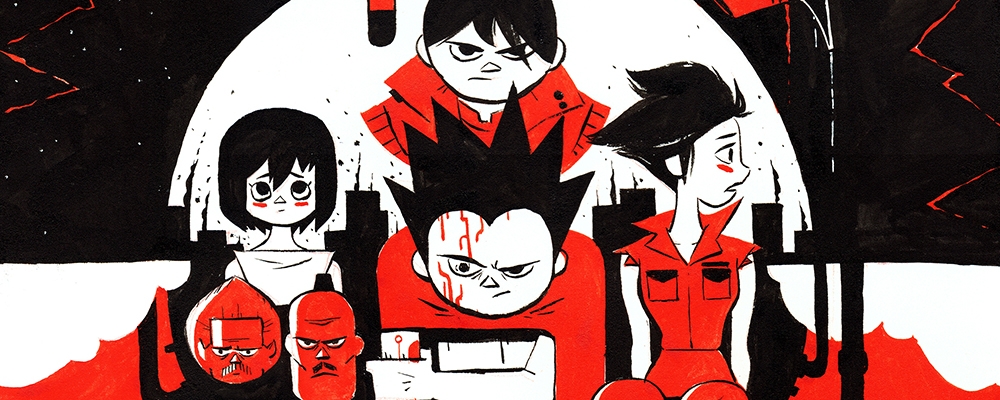
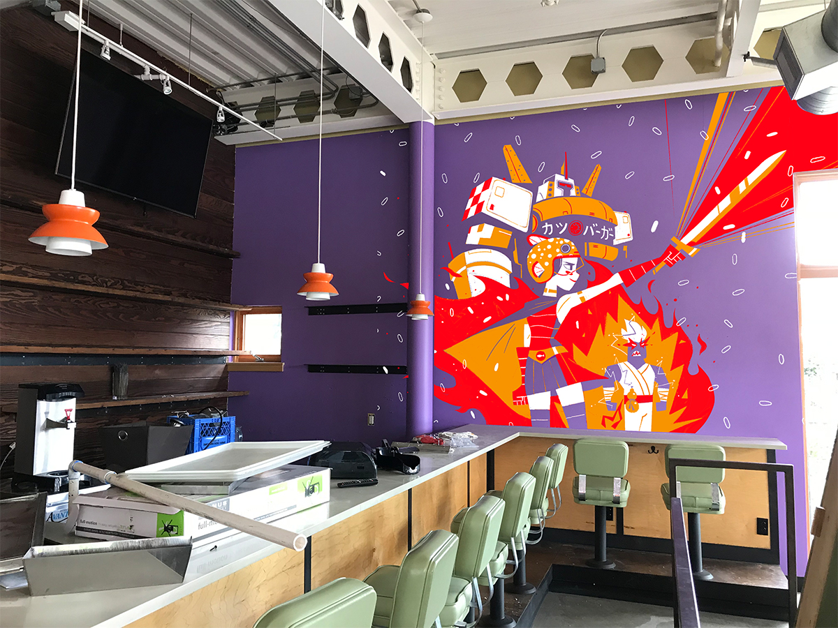
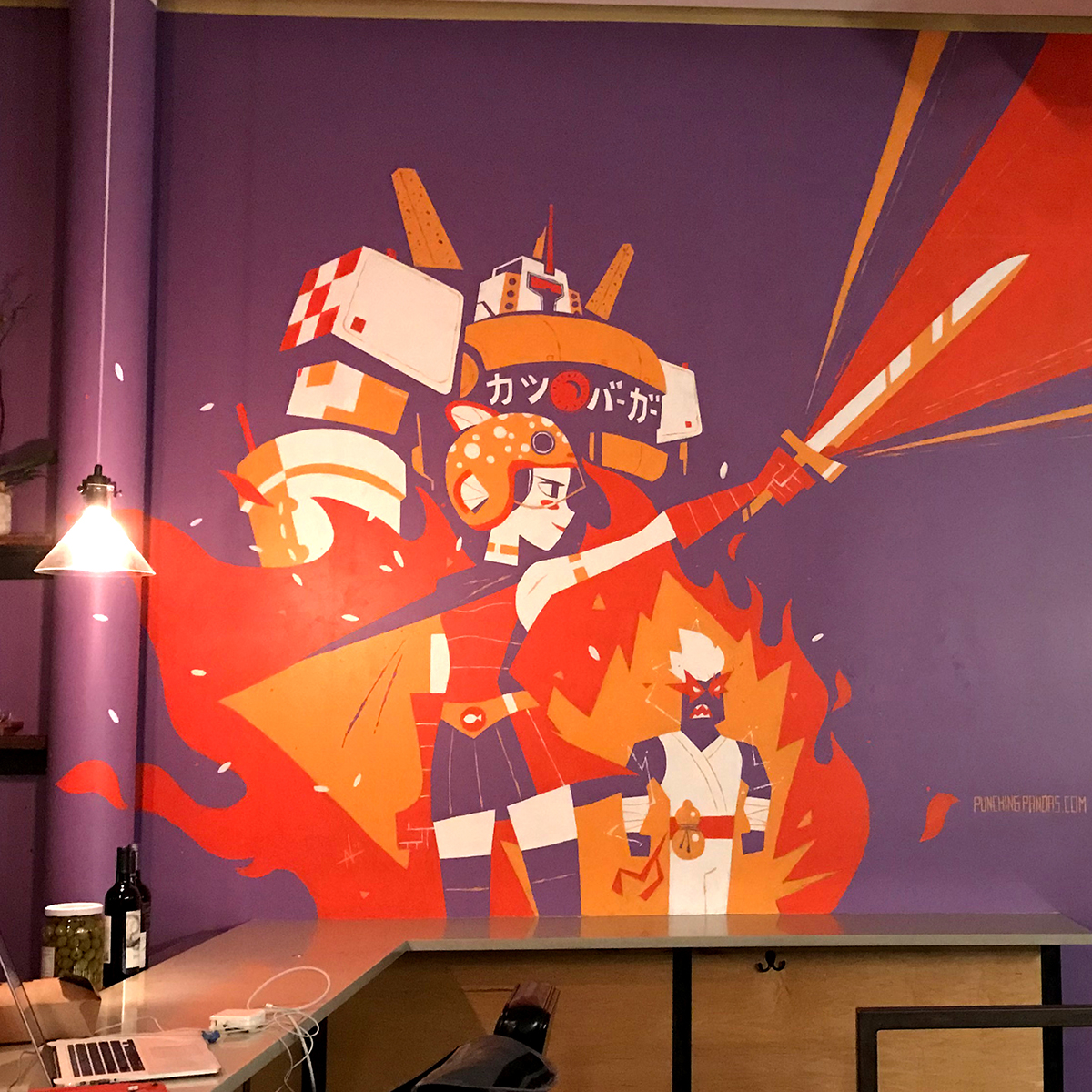
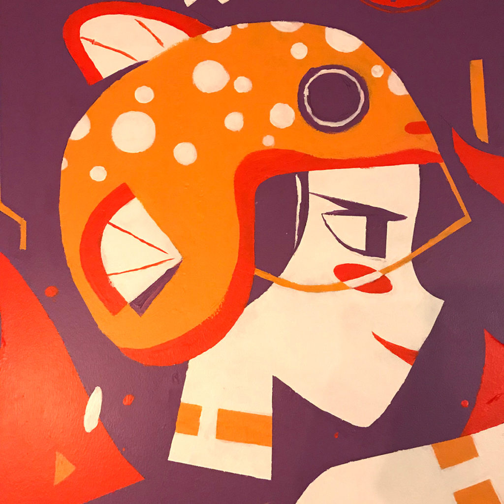
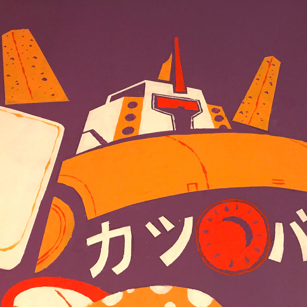
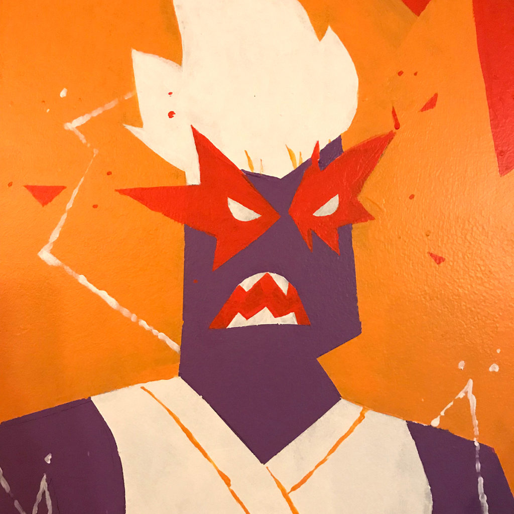
I recently completed my first mural for Katsu Burger, a local restaurant chain that specializes in Japanese-fusion burgers. The location is in Ballard and is the first Katsu Burger to feature sushi and bento boxes on their menu. Read on to learn about my process for creating my first mural and to watch a timelapse video of the whole process.

So how does on get started on their first mural? With help of course! I reached out to Justin Hillgrove who did a mural at Facebook. He in turn referred me to Mural Joe‘s videos which provided much needed help with how to get started.

The owners were very generous in allowing me the freedom to do whatever I wanted which can sometimes be difficult because there can be infinite possibilities. They expressed that they were open to having elements of Japanese pop culture like robots, Dragonball, ninjas, so I went with that line of thinking and began to brainstorm.

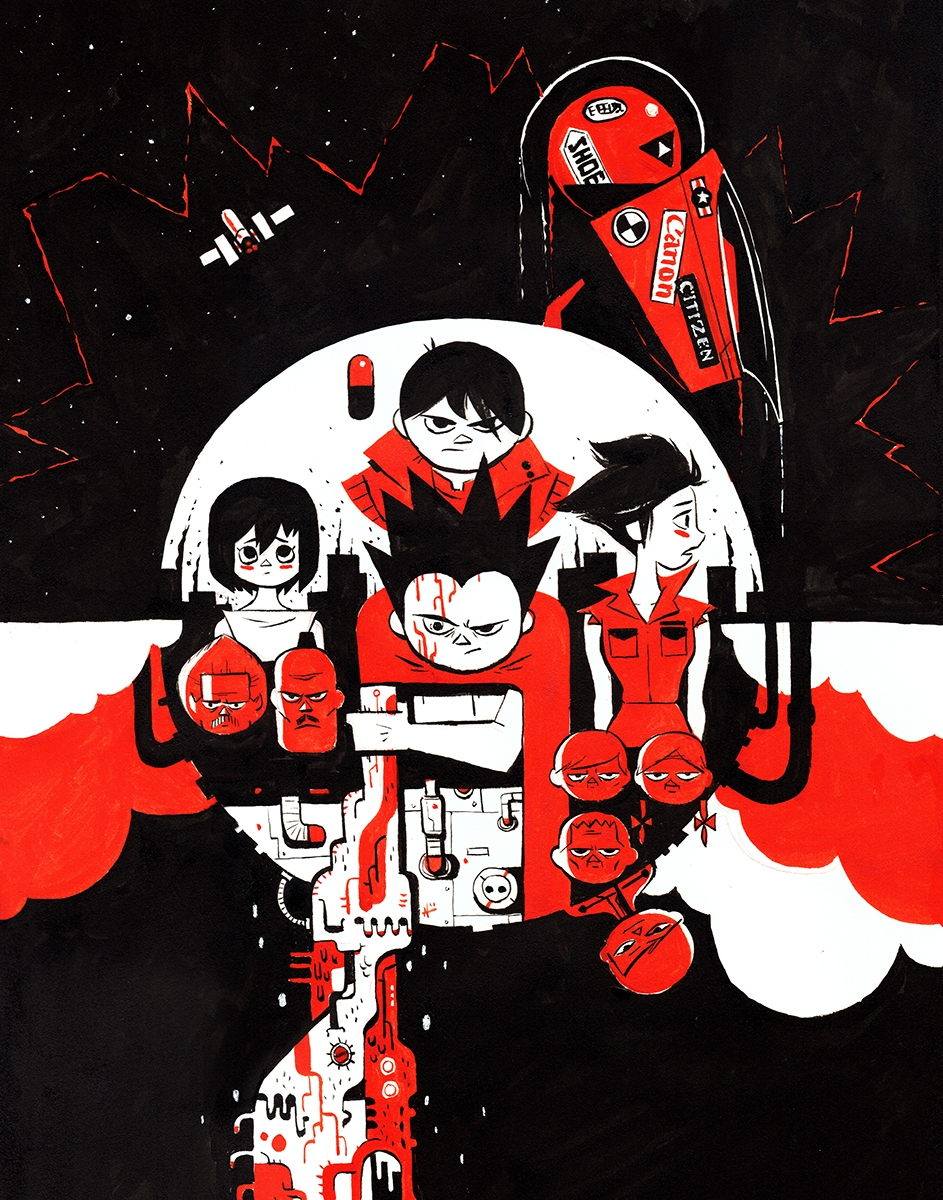
One of the ideas that I had was having a set of warriors battling a giant “hunger monster” in the form of Godzilla. As I continued to develop the idea, the canvas began to feel a bit cramped with all of the characters especially if the hunger monster was going to be a giant. So I eliminated the hunger monster and focused on the warriors. Since this Katsu Burger location was going to feature sushi, I came up with the idea of having a warrior represent a portion of the menu: a robot represent the burger, a samurai for sushi, and a powered-up ninja representing drinks (the flames representing the alcohol burn). I later changed the samurai to a female Gatchaman-style superhero since I didn’t want to have all of the warriors looking masculine. Below is the concept art that I submitted to the owners. I also included a Photoshop mockup to help them visualize how the final design would fit on the wall.

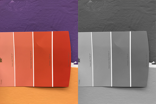
Part of the reason why I made the design in three colors was because I anticipated using the same wall paint used in all of the Katsu Burgers. The only exception was the red, which I needed to find on my own. The way that I selected the red was to make a print out of my concept art and find the matching swatch at Home Depot. One thing I noticed was that the existing wall paints were slightly less saturated than the colors used in my concept art (which I sampled from Katsu Burger’s logo); so I adjusted the red by picking the swatch that was one level desaturated from the matching color. I then took a photo of the swatches next to the existing wall paint and removed the saturation to see how the values compared to one another.

Another reason why I made this mural with three colors was because I wanted a flat graphic look. As part of my research, I also came across a mural done by Kevin Dart for the old location of Q Pop Shop in LA.

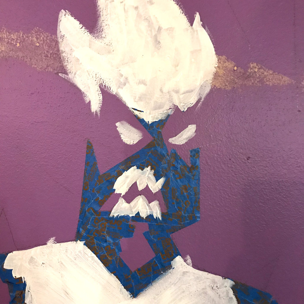
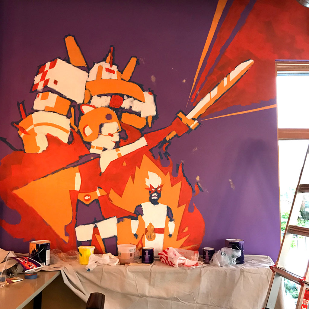
With the concept art completed, it was time to do the real painting. I borrowed a friend’s projector and directed it at the wall where I subsequently traced the major shapes in pencil. Afterwards, I blocked off the major shapes for the white with painter’s tape. I probably was a bit too meticulous with some of the details and could’ve done some of it by hand, but since this was my first mural, I wasn’t experienced enough to know any better.

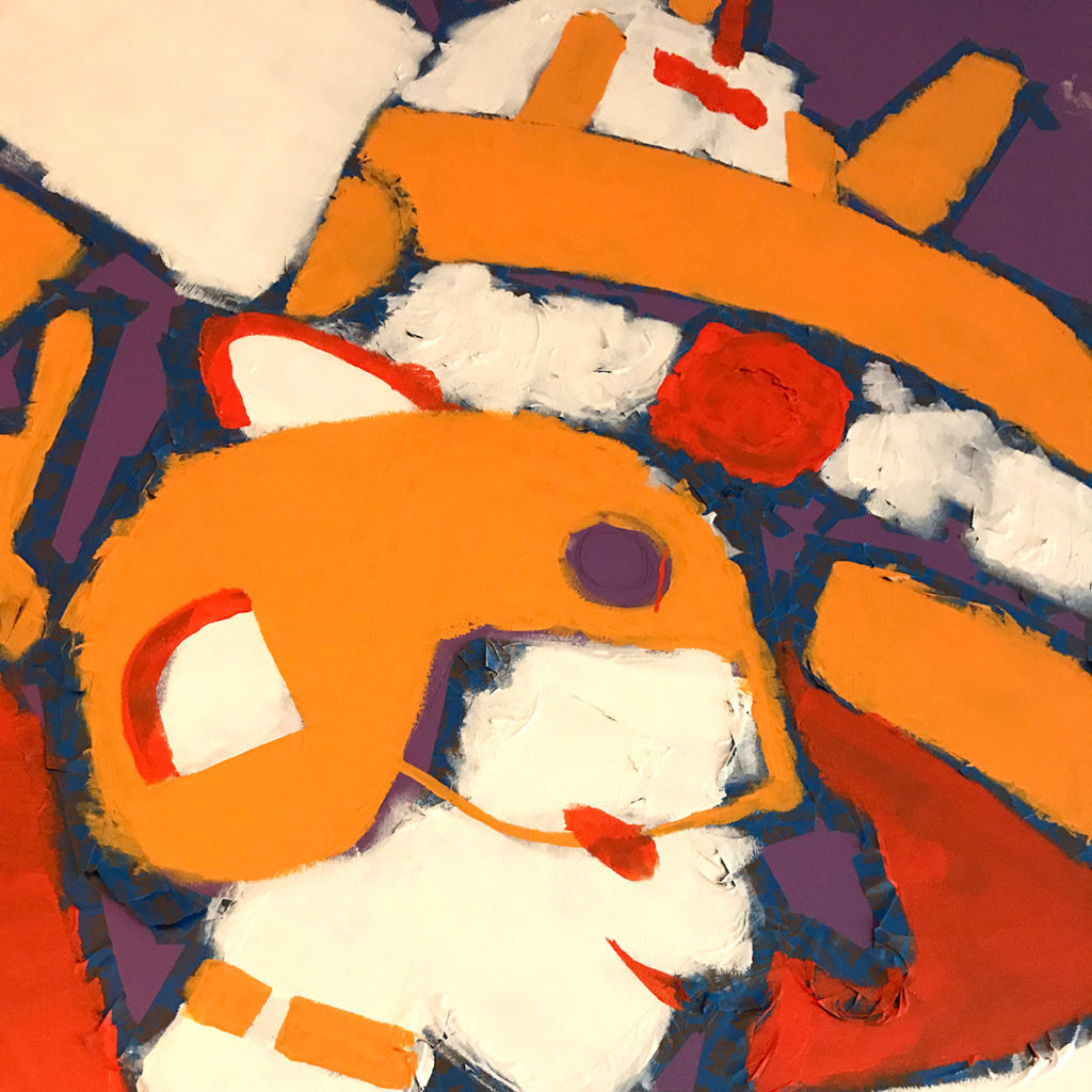
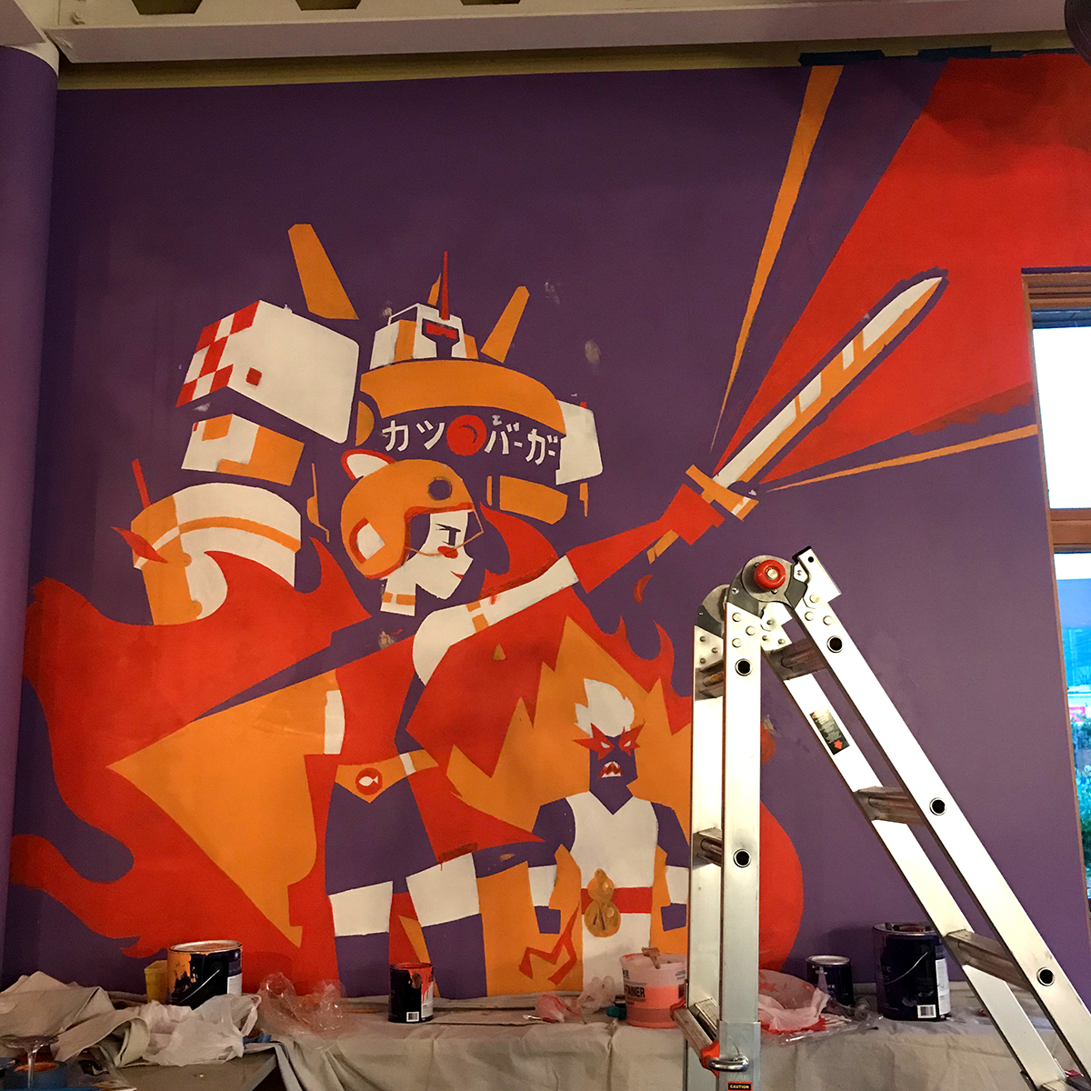
For the colors, I started from light to dark beginning with the white sections, then the yellow, and then the red. Because I had to leave on the tape, the wall looks a bit messy. There were many times that I had to resist the urge to remove the tape just to see what was underneath.

After all the paints have been added, it was time to remove the tape. Removing the tape was one of the most satisfying parts of this process. It’s equivalent to pouring a bunch of Elmer’s glue on your hand and peeling back the dried bits. Don’t judge me.

Finally, all that was left to do was clean up the edges and add the small details which sounds much easier than it actually is. Finishing this piece felt like giving someone a haircut by cutting one hair at a time. I didn’t add in as many grains of rice as in the concept because I felt like it would make the wall look too busy. I might go back and add a couple more details on my next visit if I feel there’s a need.

Finally, here is a timelapse video that I posted to YouTube of the whole process, go check it out.

Thanks to Tom, Stephanie, and Christopher for giving me the opportunity to work on this project and for feeding me for a week. Thanks also to Justin Hillgrove for his insights and introducing me to mural painting. And big thanks to Laura for providing the projector. Lastly, thanks to the panda family for having to adjust to my schedule because I couldn’t paint fast enough.

Cheers

N
Dragon Dog Pandas

  • by

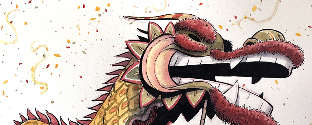
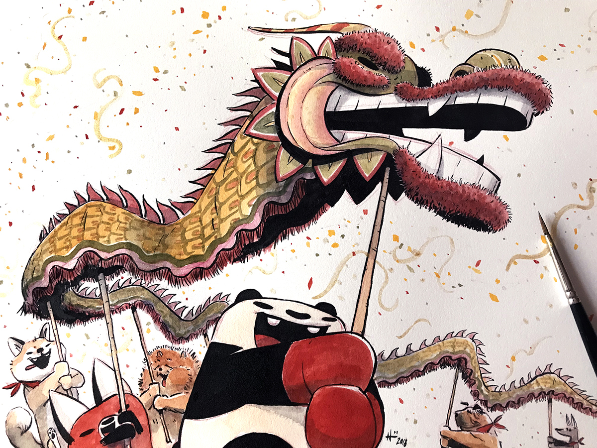
Dogs throw the best party, because dogs always pay for catering.

Smash Pandas Commission

  • by

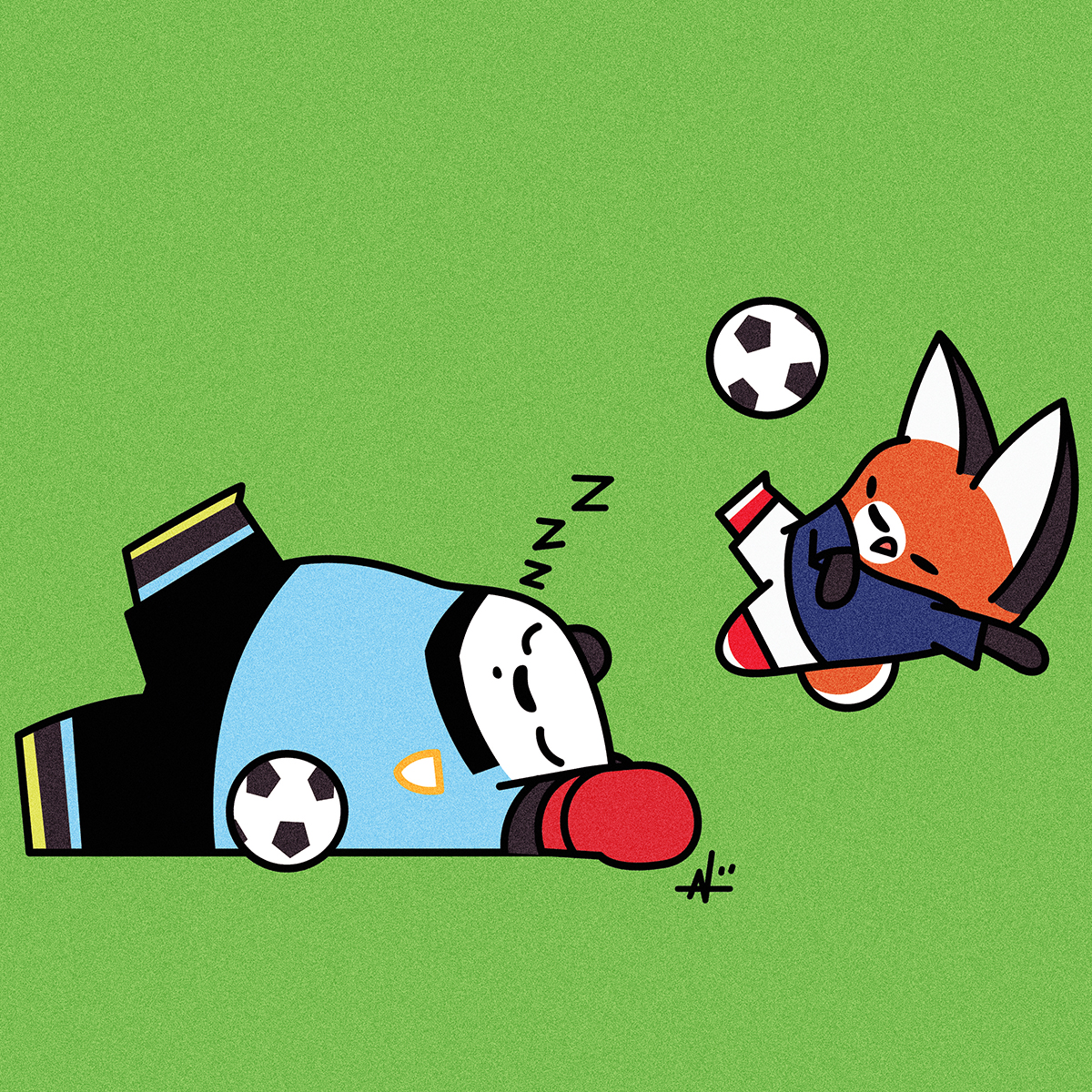
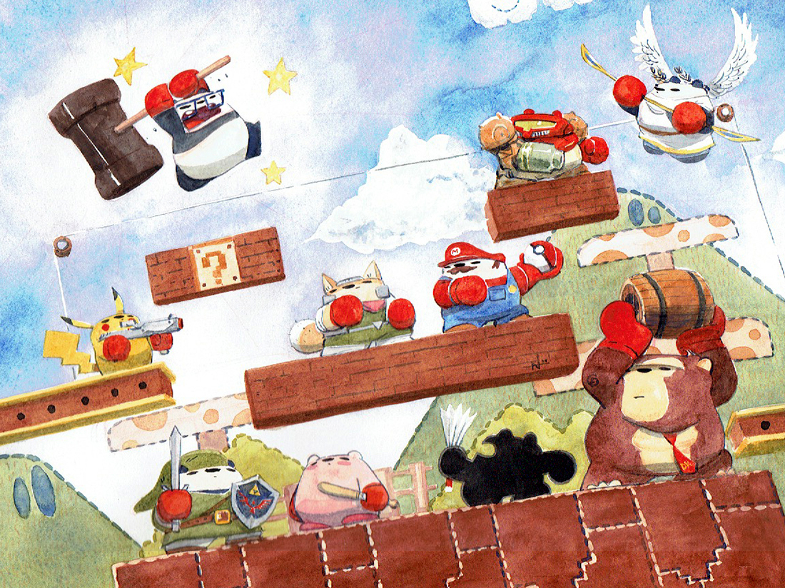
Hooman ask panda if panda could dress up like Smash Brothers characters from video game.  Panda guess hoomans like video game, but panda don’t understand why sitting in front of TV and pushing buttons is fun. That don’t sound fun, it sounds weird and unproductive. What is productive is sleep. Doctor say sleep very important and the more sleep panda get, the more panda is productive. So panda is going to get A LOT of sleep.

Business Pandas

  • by

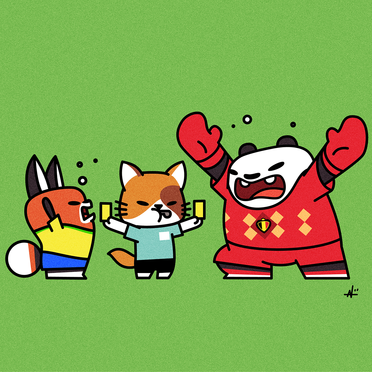
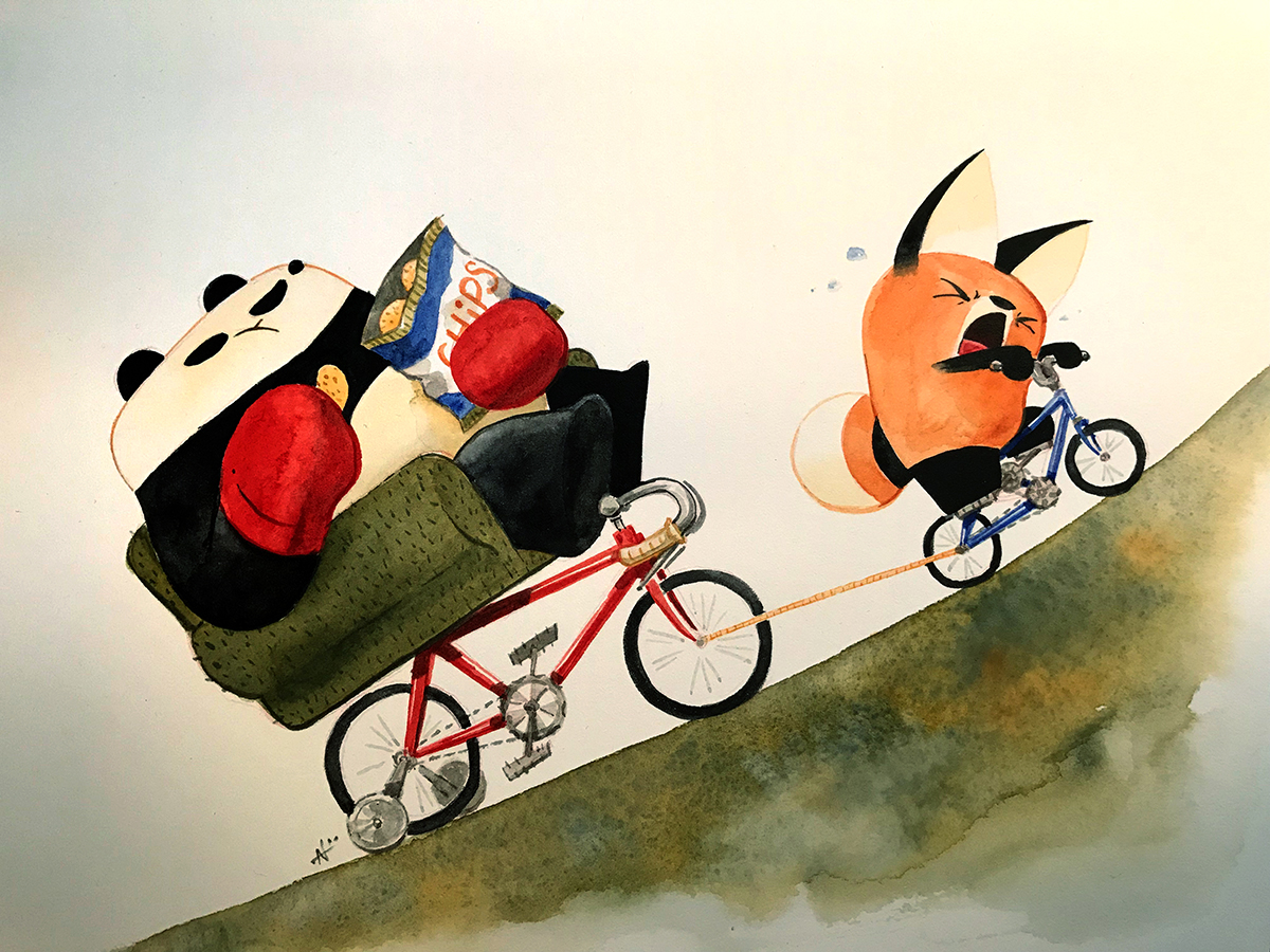
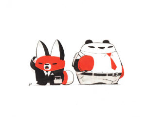
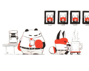
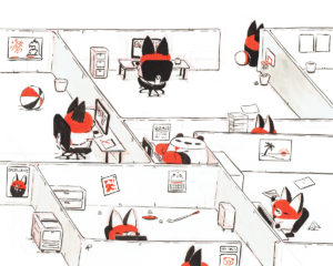
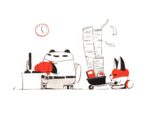
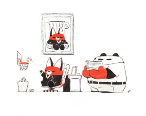
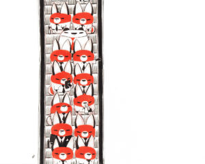
Like hoomans, panda have bills to pay. Panda’s work is no different than hoomans. Some all days are hard, but panda don’t mind, so long as panda get paid so panda can buy bamboo to eat.

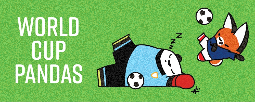
Hoomans can see business pandas on display at Eastern Cafe from March to April. Go visit and buy coffee to support cafe, and then give coffee to panda.

Happy Chinese New Year

  • by

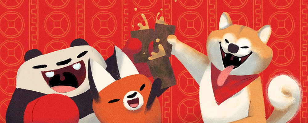
Happy Year of Dog! Dog is good friend because dog pays for panda’s drinks. Even if dog doesn’t know.

“The Panda is Fat” and ECCC

  • by

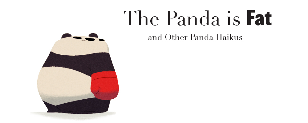
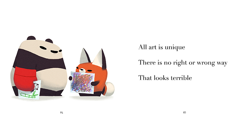
Panda has special announcement, panda will release new book, “The Panda is Fat and Other Panda Haikus” at ECCC, March 1-4. Panda will be selling book for hoomans visiting convention. The book is panda’s biggest book with over 90 panda pages with drawings and haikus. Panda will have hooman pet hooman Nolen update the shop because he too busy drawing panda’s book lazy. Below are some samples from the best book in the world.

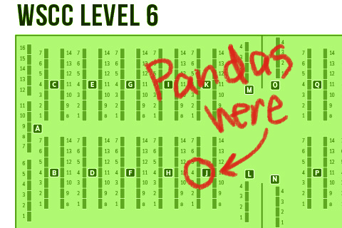
Panda will also be at Table J4 in Artist Alley. Panda drew directions in map below, panda is so talented. My pet hooman will be chained to at the table to help you with all your panda needs. Come visit table and show some panda love, or else.

Panda out.

Monsters and Dames 2018

  • by

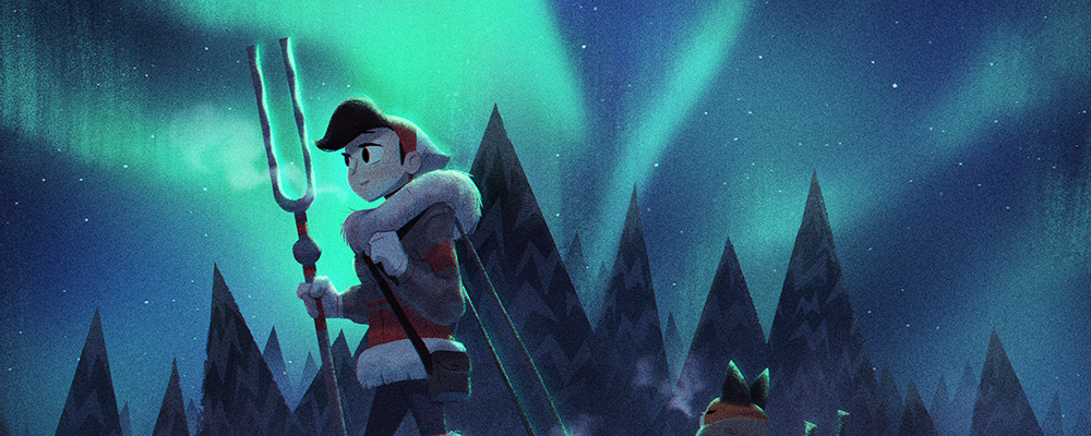
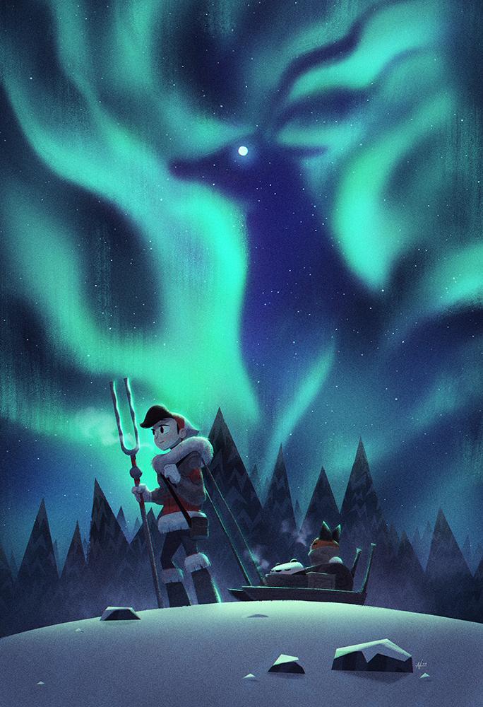
I’m happy to announce that my entry was accepted into Emerald City Comicon’s Monsters and Dames art book. This year’s entry also includes a cast of three compared to my last couple of entries.  I will also be tabling at the ECCC artists alley again Mar 1-4, so if you plan on purchasing the art book, come see at Table J4 so I can sign your book. You can read more about the details and other artists in the book on ECCC’s Monsters and Dames page.

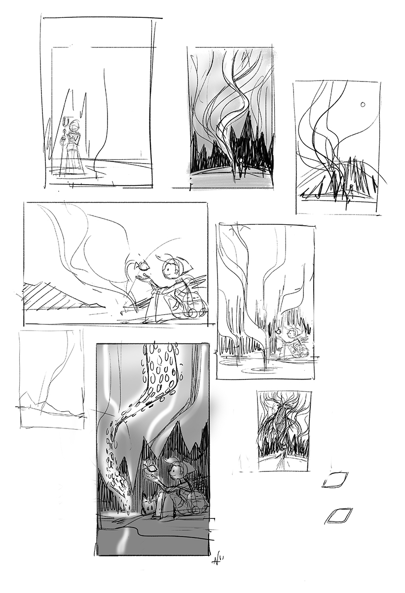
It took a while for me to land on a concept. I knew I was going to do something with northern lights, so my first concept had glowing fish flying out of a lake and forming the lights in the sky. After trying out several compositions, I felt like the idea wasn’t working for me. I was also starting to run out of time to work on the piece, so I decided instead to go with a different idea for the figure in the sky.

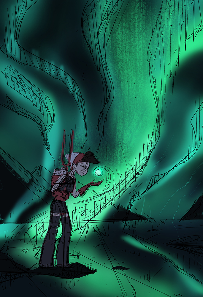
I also doodled a bit with the colors to figure out what the end result could look like. Another reason for abandoning the fish concept was because I didn’t want to make this piece feel like a continuation from last year’s entry which was also on a lake.

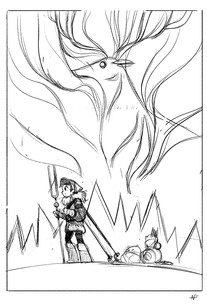
I started playing around with the lines of the northern lights and ended up with a stag-like creature. Northern lights have a flowing quality to them, and it felt like the stag was a good solution.

Lastly, I gave the Panda Courier a winter makeover and included the red panda just because I feel like it’s about time he gets included in one of these pieces.

Oh, and one more thing. Next week, I might be taking over a certain Instagram account. You’ve been warned.

Picture book preview

  • by

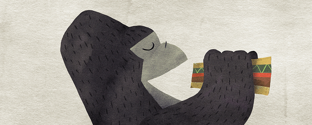
Here’s a little work in progress for a story I’ve been working on. I won’t reveal the plot just yet, but let’s just say it has to do with a gorilla and a picnic. Below is an art test that I made for the gorilla. Right now, I’m also putting together a dummy book as a rough draft, and eventually moving on to more developed art. There will be more updates coming up in the next few months, but in the meantime, enjoy this little preview of things to come.

Smartsheet: Photon

  • by

UPDATE: You can read more about Smartsheet’s Photon release on their blog.

This is another commission that I completed for Smartsheet’s “Photon” release similar to the Endeavour piece I worked on a few months ago. For this month’s theme, I decided to go a bit more abstract. When I was in engineering school, one of the physics courses went over light. One of the cool things about light is the phenomenon known as the wave-particle duality. The quick and dirty version is that light is made up of particles that can also act like waves. You can observe the particle behavior by looking at a shirt that’s been lying out in the sun too long. What’s interesting is that light can be reflected and refracted like a wave. For this piece, I wanted to incorporate both the idea of a photon as a ball of light and wave shapes to imply the duality. Man, this is sounding all so heady!

I actually knew what I wanted to paint even before I made the thumbnails, but I still did them just in case something more interesting came around. The thumbnail below is the concept that I had in mind.

After I had the thumbnail approved, I started created a bunch of geometric shapes in Illustrator. When I used shape layers in Photoshop for the Endeavour commission, it ended up increasing my file size and causing my computer to lag. made it a lot easier to edit the individual shapes instead of doing them all in Photoshop.

Below is a WIP screenshot of the piece as I’m importing the layers. I know it looks ugly, but it’s actually helpful from an organizational standpoint since I can easily tell the objects from each other as I’m moving things around. After I’m finished with placing them in the piece, I use Photoshop to blend and paint to make the piece feel more organic. Usually when working in digital, the piece tends to look sterile because the colors and shapes can be so precise and perfect. So much of the work is spent trying to “roughen” up the piece to make it look more appealing and interesting.

Finally, after many adjustment layers, masks, and smart layers, I finally arrive at the final piece. This piece was a lot of fun to work on since it’s more of an abstract subject that’s different from the usual characters and pandas. Thanks again to Smartsheet for the opportunity to work on this.

I have a special coupon for my shop that’s good until 12/24. Use the code “bfpandas17” to get 30% off your order. Happy holidays, everyone!

Holiday Pandas

  • by

‘Tis the season for holiday pandas!

I’ve been posting some daily sketches during Advent season on my social media channels. You can subscribe to any of the following feeds to see the latest pieces.

[social_icons type=”circle_social” icon=”fa-twitter” use_custom_size=”no” size=”fa-2x” link=”twitter.com/punchingpandas” target=”_self”][social_icons type=”circle_social” icon=”fa-facebook” use_custom_size=”no” size=”fa-2x” link=”https://www.facebook.com/punchingpanda/” target=”_self”][social_icons type=”circle_social” icon=”fa-instagram” use_custom_size=”no” size=”fa-2x” link=”https://www.instagram.com/punching.pandas/” target=”_self”][social_icons type=”circle_social” icon=”fa-tumblr” use_custom_size=”no” size=”fa-2x” link=”https://nolenlee.tumblr.com/” target=”_self”]

Also, back in 2014 I did a series of holiday pandas based on the #Illo_Advent prompt on Twitter. You can check out my old drawings in this post. Happy holidays, everyone!