Skip to content

Blog

Smartsheet: Photon

  • by

UPDATE: You can read more about Smartsheet’s Photon release on their blog.

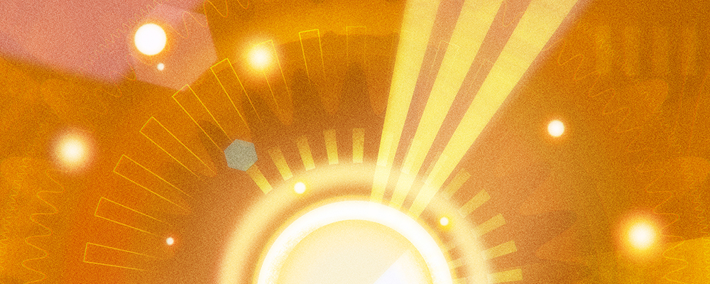
This is another commission that I completed for Smartsheet’s “Photon” release similar to the Endeavour piece I worked on a few months ago. For this month’s theme, I decided to go a bit more abstract. When I was in engineering school, one of the physics courses went over light. One of the cool things about light is the phenomenon known as the wave-particle duality. The quick and dirty version is that light is made up of particles that can also act like waves. You can observe the particle behavior by looking at a shirt that’s been lying out in the sun too long. What’s interesting is that light can be reflected and refracted like a wave. For this piece, I wanted to incorporate both the idea of a photon as a ball of light and wave shapes to imply the duality. Man, this is sounding all so heady!

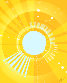
I actually knew what I wanted to paint even before I made the thumbnails, but I still did them just in case something more interesting came around. The thumbnail below is the concept that I had in mind.

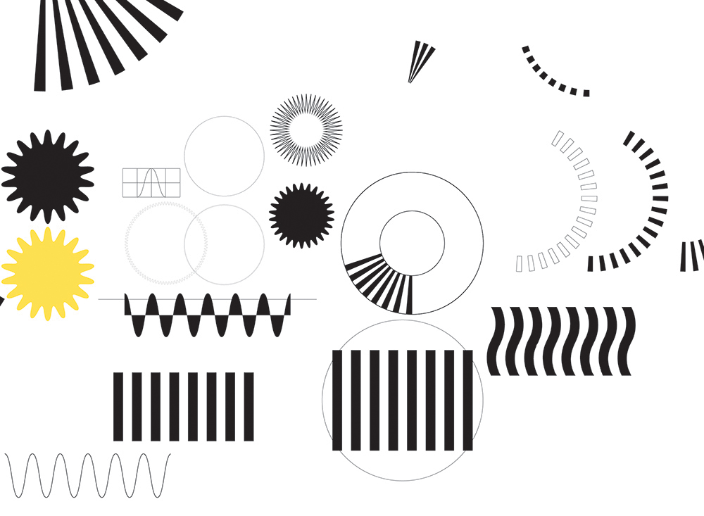
After I had the thumbnail approved, I started created a bunch of geometric shapes in Illustrator. When I used shape layers in Photoshop for the Endeavour commission, it ended up increasing my file size and causing my computer to lag. made it a lot easier to edit the individual shapes instead of doing them all in Photoshop.

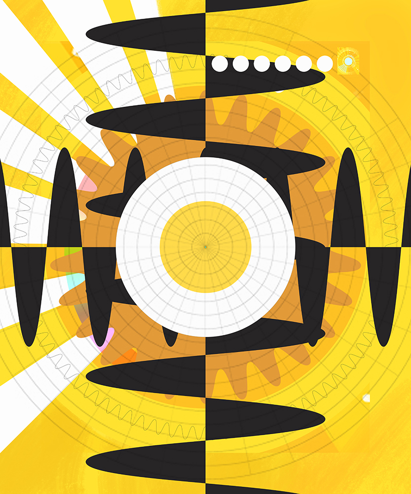
Below is a WIP screenshot of the piece as I’m importing the layers. I know it looks ugly, but it’s actually helpful from an organizational standpoint since I can easily tell the objects from each other as I’m moving things around. After I’m finished with placing them in the piece, I use Photoshop to blend and paint to make the piece feel more organic. Usually when working in digital, the piece tends to look sterile because the colors and shapes can be so precise and perfect. So much of the work is spent trying to “roughen” up the piece to make it look more appealing and interesting.

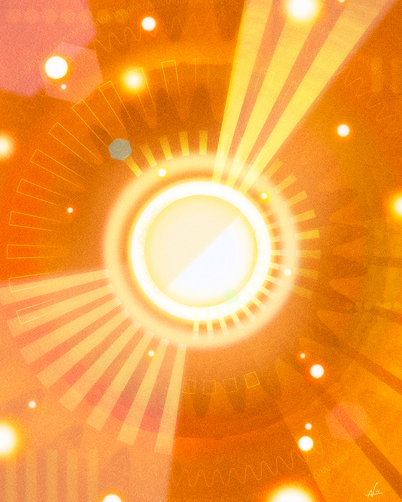
Finally, after many adjustment layers, masks, and smart layers, I finally arrive at the final piece. This piece was a lot of fun to work on since it’s more of an abstract subject that’s different from the usual characters and pandas. Thanks again to Smartsheet for the opportunity to work on this.

I have a special coupon for my shop that’s good until 12/24. Use the code “bfpandas17” to get 30% off your order. Happy holidays, everyone!
Holiday Pandas

  • by

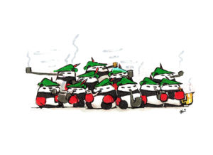
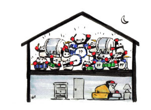
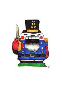
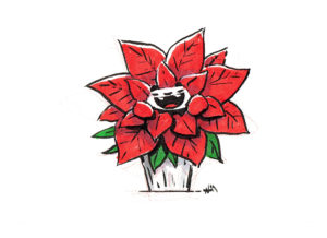
‘Tis the season for holiday pandas!

I’ve been posting some daily sketches during Advent season on my social media channels. You can subscribe to any of the following feeds to see the latest pieces.

[social_icons type=”circle_social” icon=”fa-twitter” use_custom_size=”no” size=”fa-2x” link=”twitter.com/punchingpandas” target=”_self”][social_icons type=”circle_social” icon=”fa-facebook” use_custom_size=”no” size=”fa-2x” link=”https://www.facebook.com/punchingpanda/” target=”_self”][social_icons type=”circle_social” icon=”fa-instagram” use_custom_size=”no” size=”fa-2x” link=”https://www.instagram.com/punching.pandas/” target=”_self”][social_icons type=”circle_social” icon=”fa-tumblr” use_custom_size=”no” size=”fa-2x” link=”https://nolenlee.tumblr.com/” target=”_self”]

Also, back in 2014 I did a series of holiday pandas based on the #Illo_Advent prompt on Twitter. You can check out my old drawings in this post. Happy holidays, everyone!
Inktober 2017: Red and Black

  • by

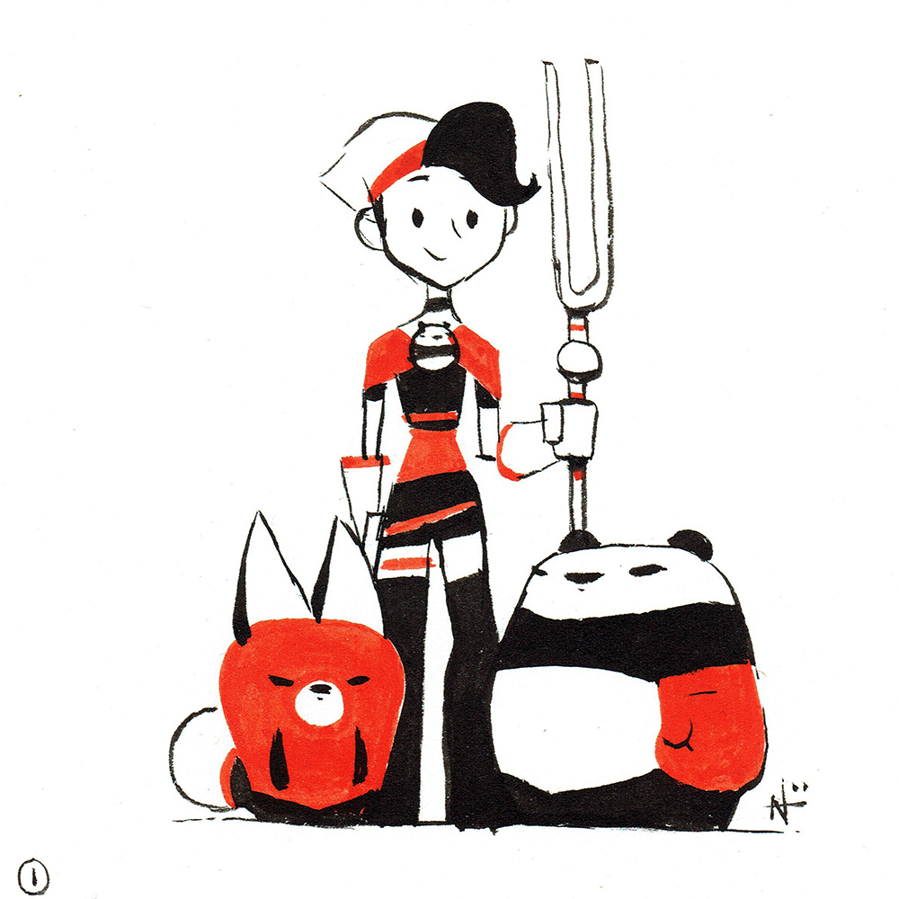
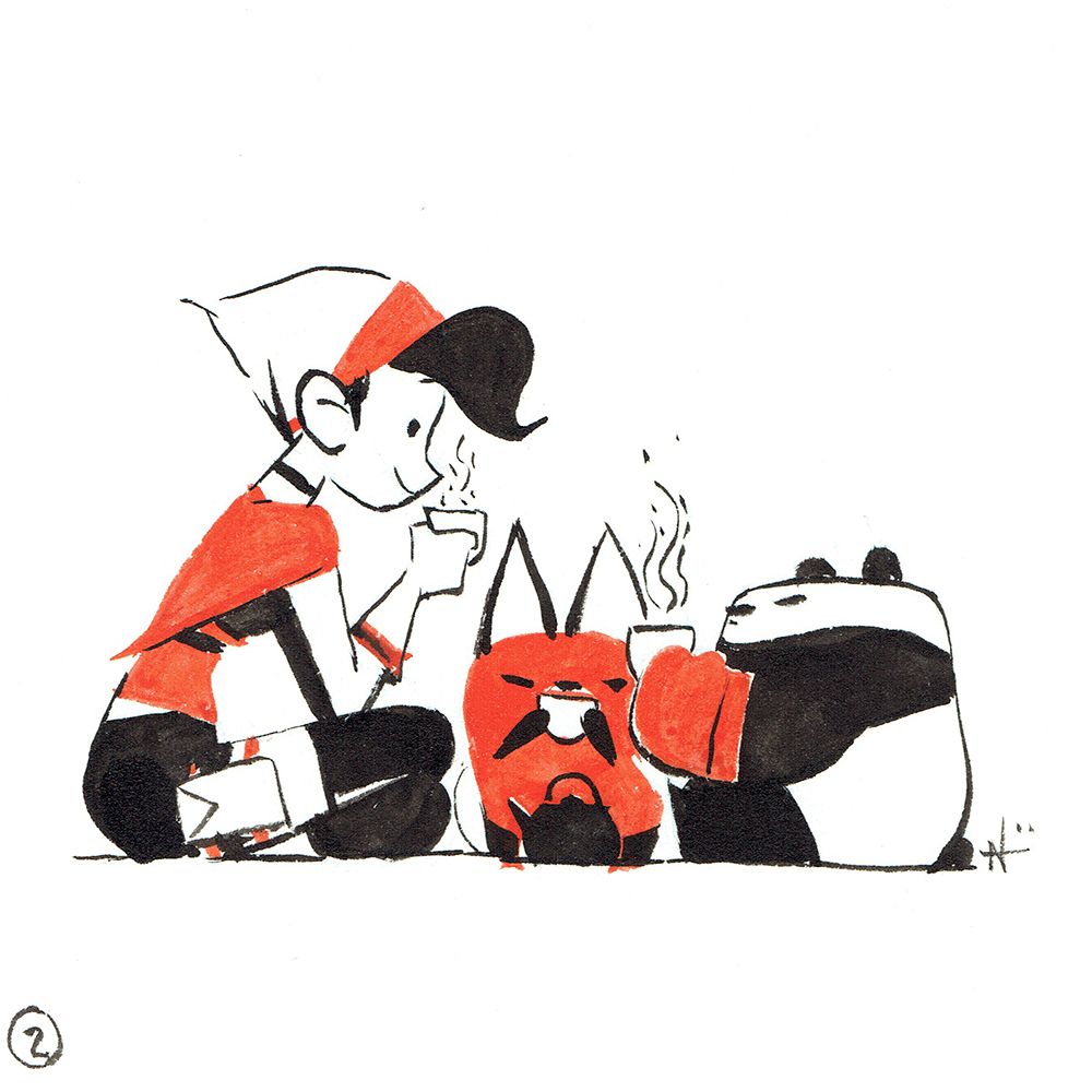
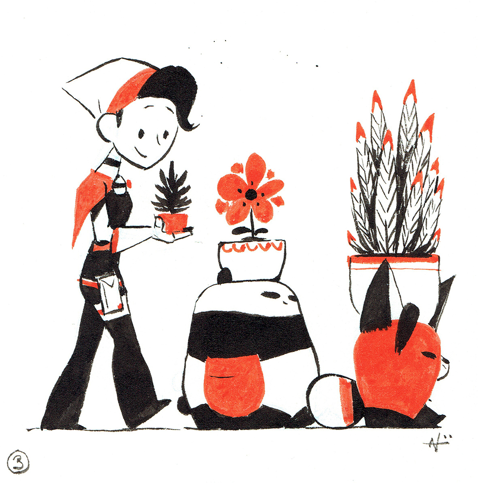
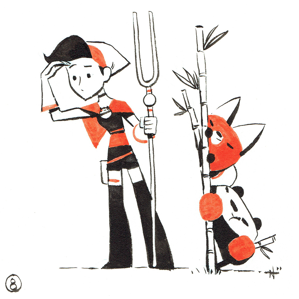
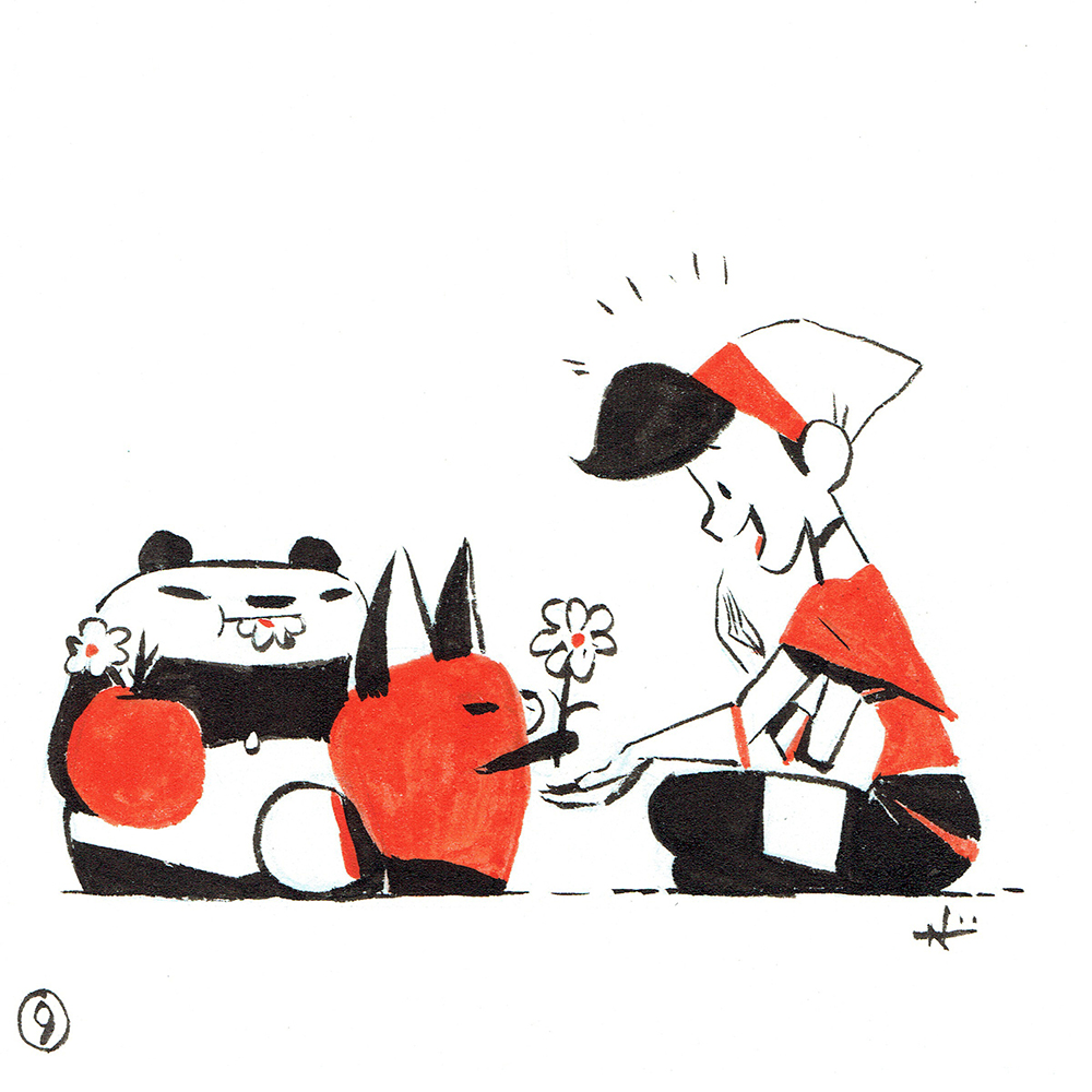
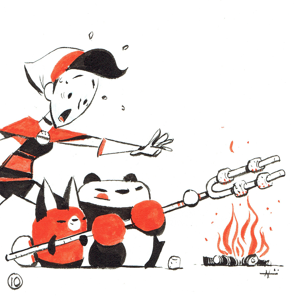
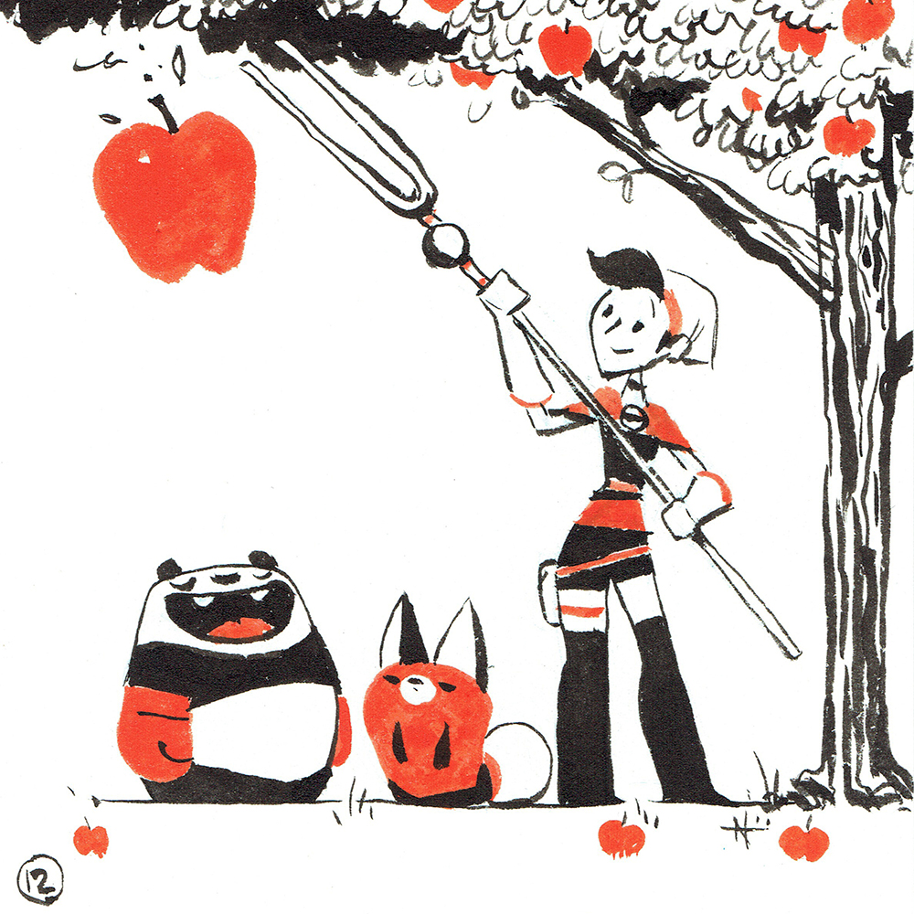
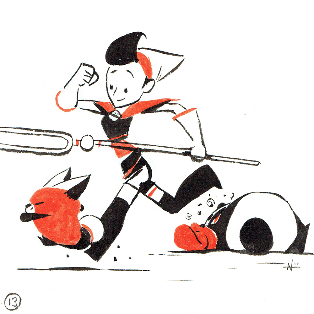
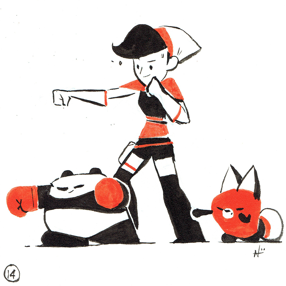
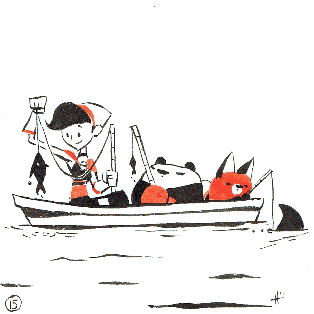
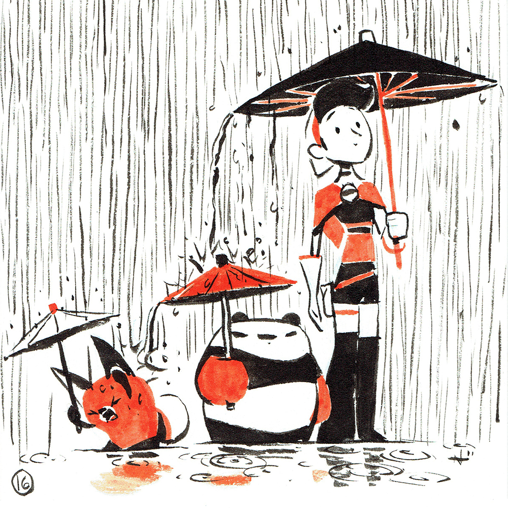
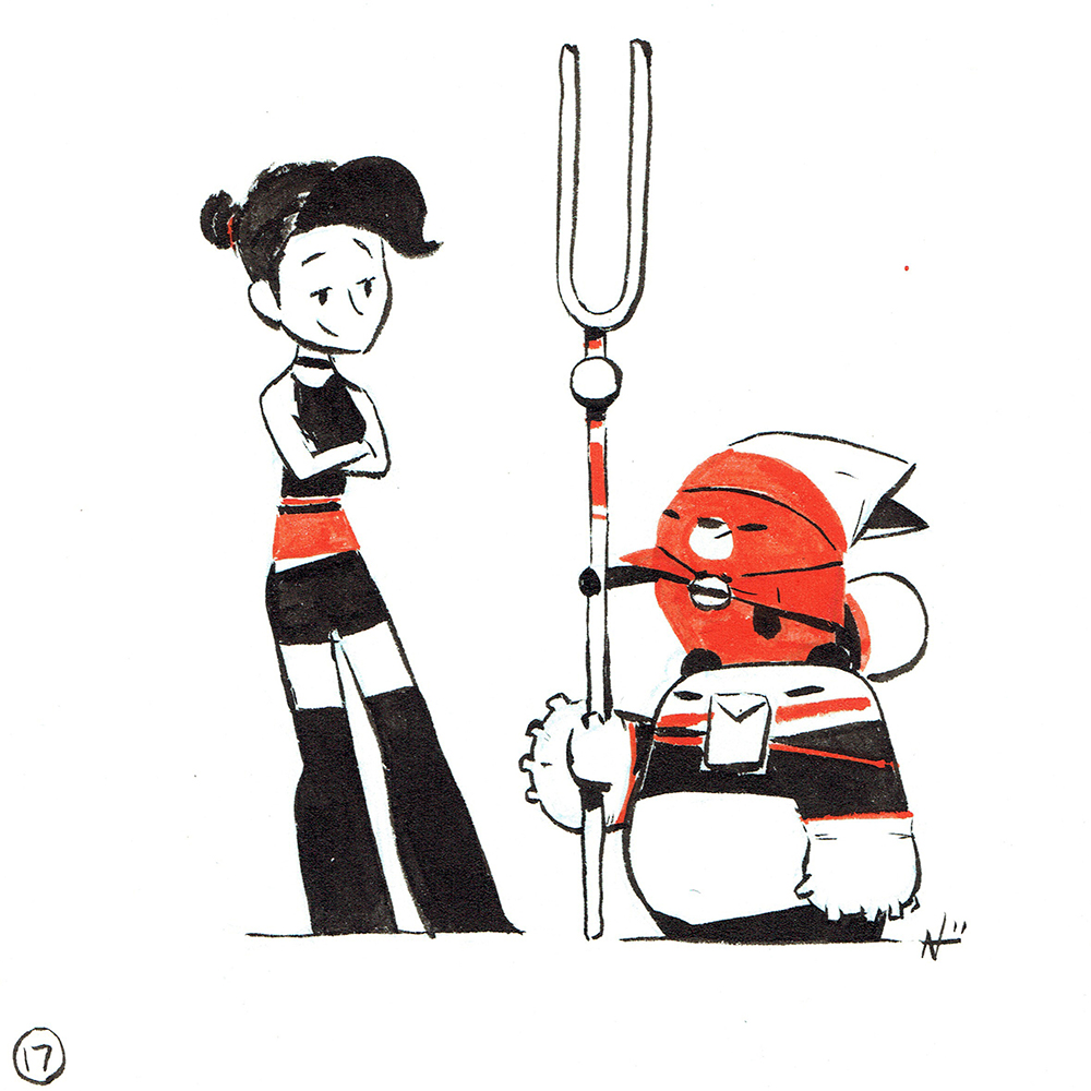
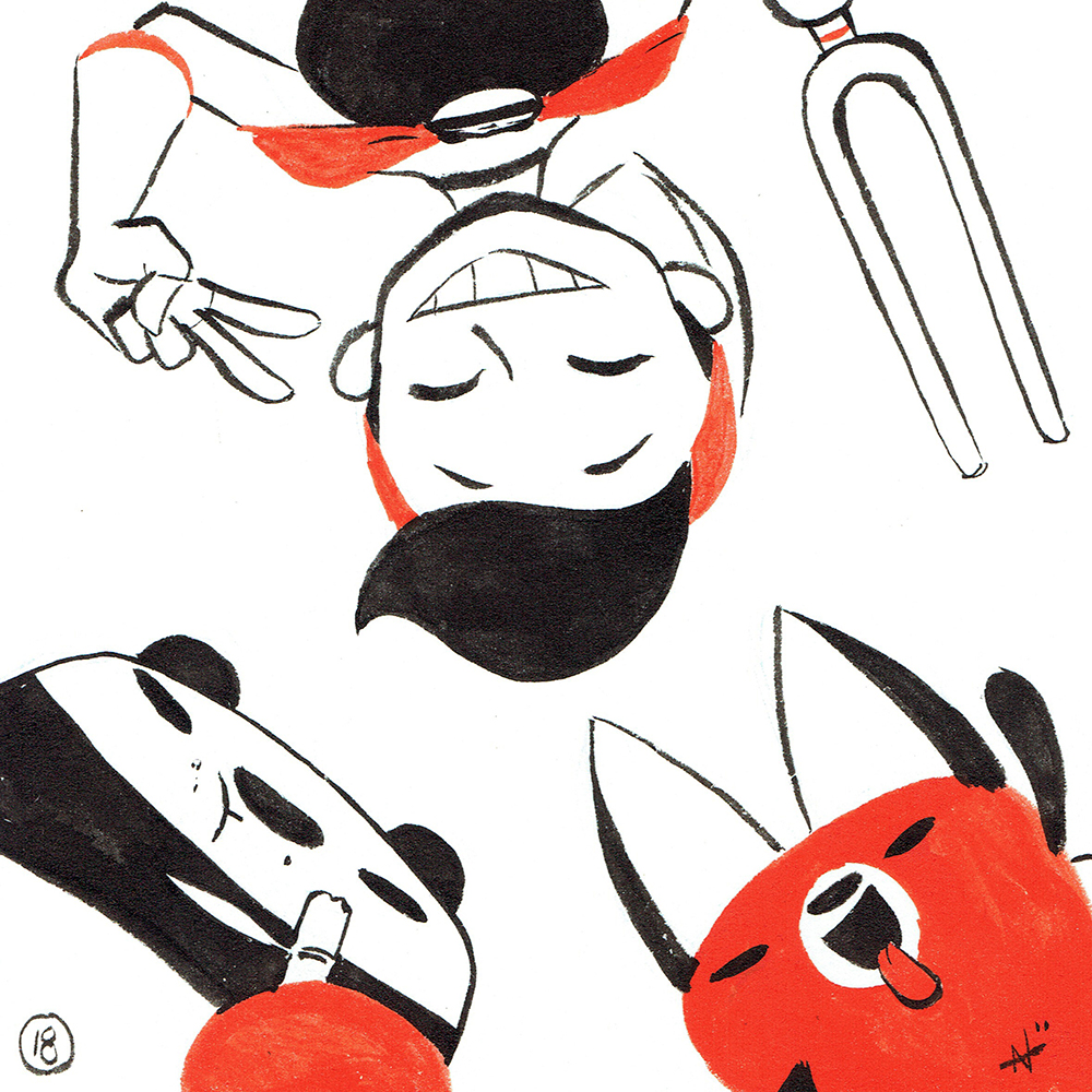
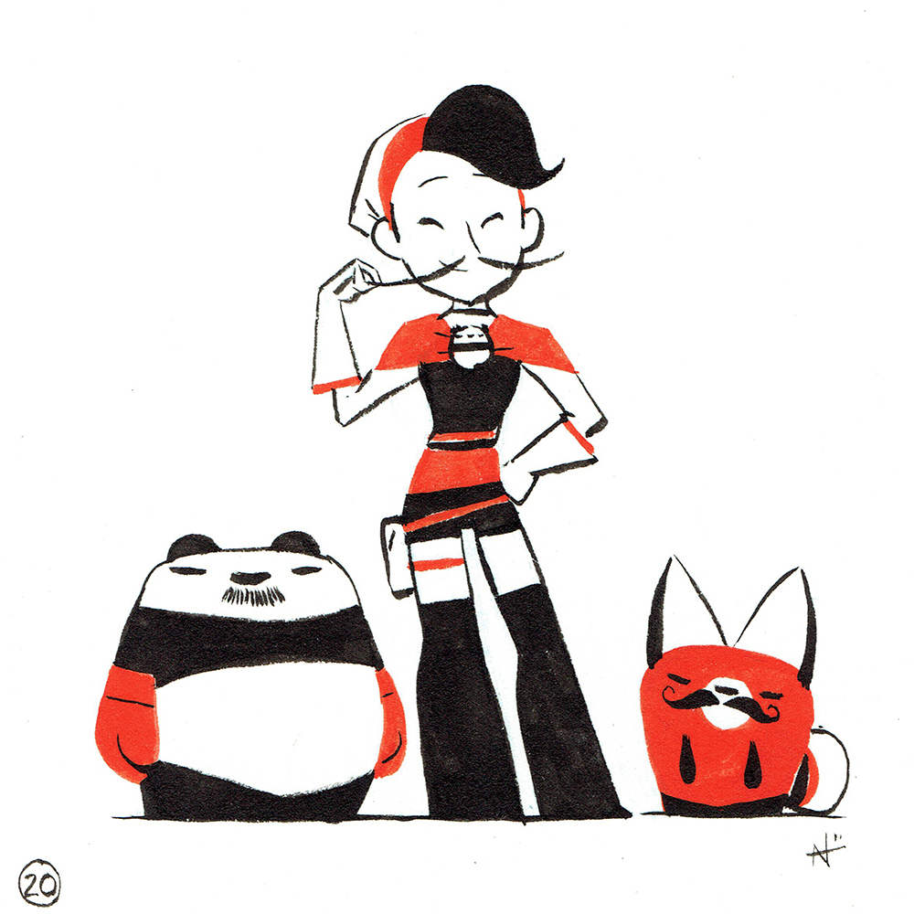
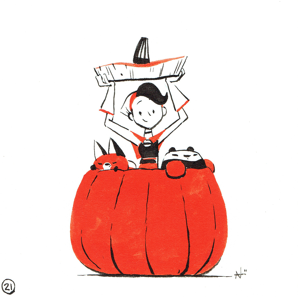
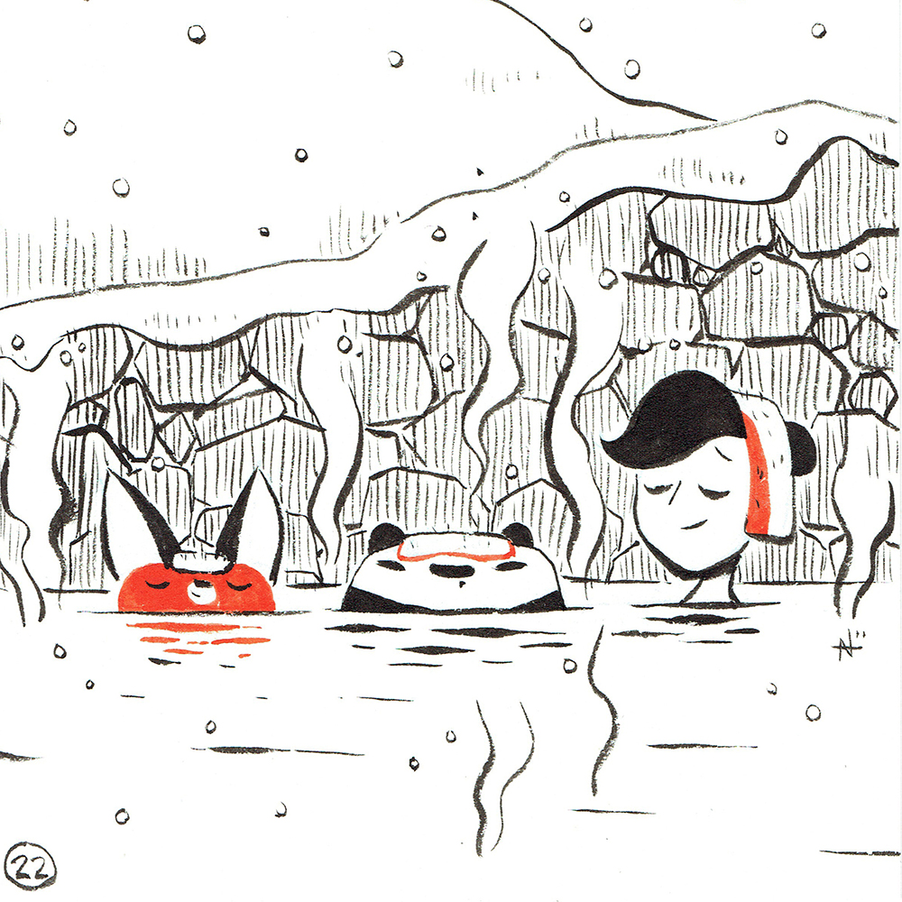
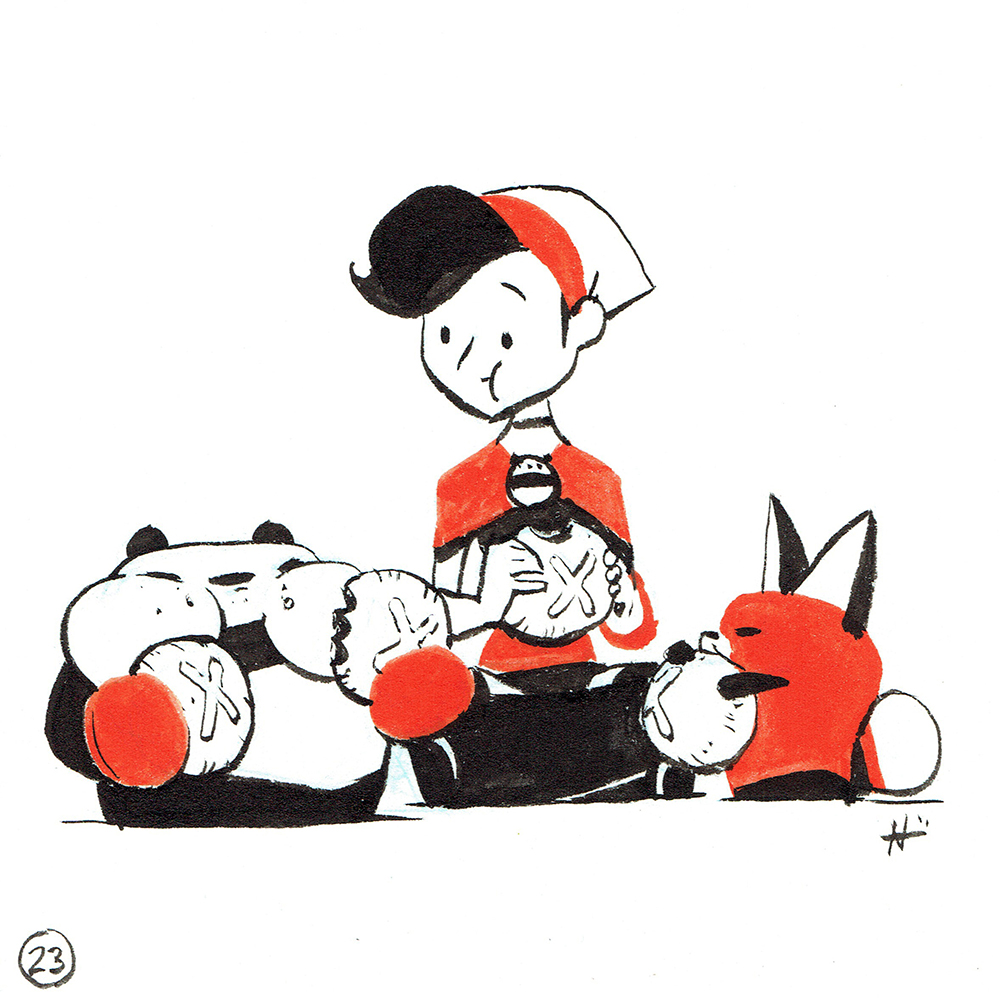
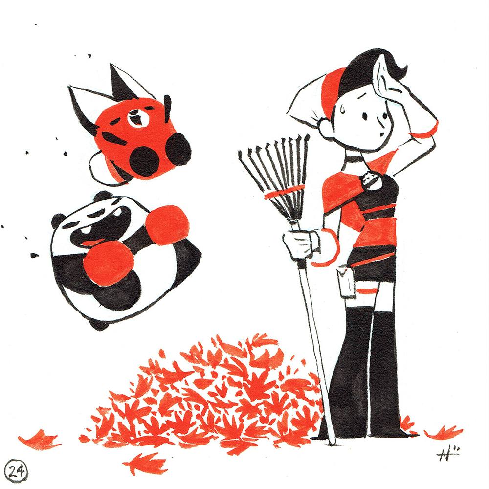
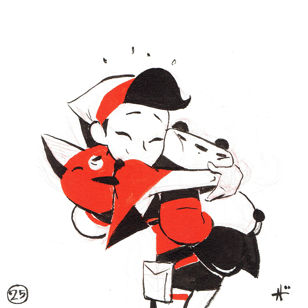
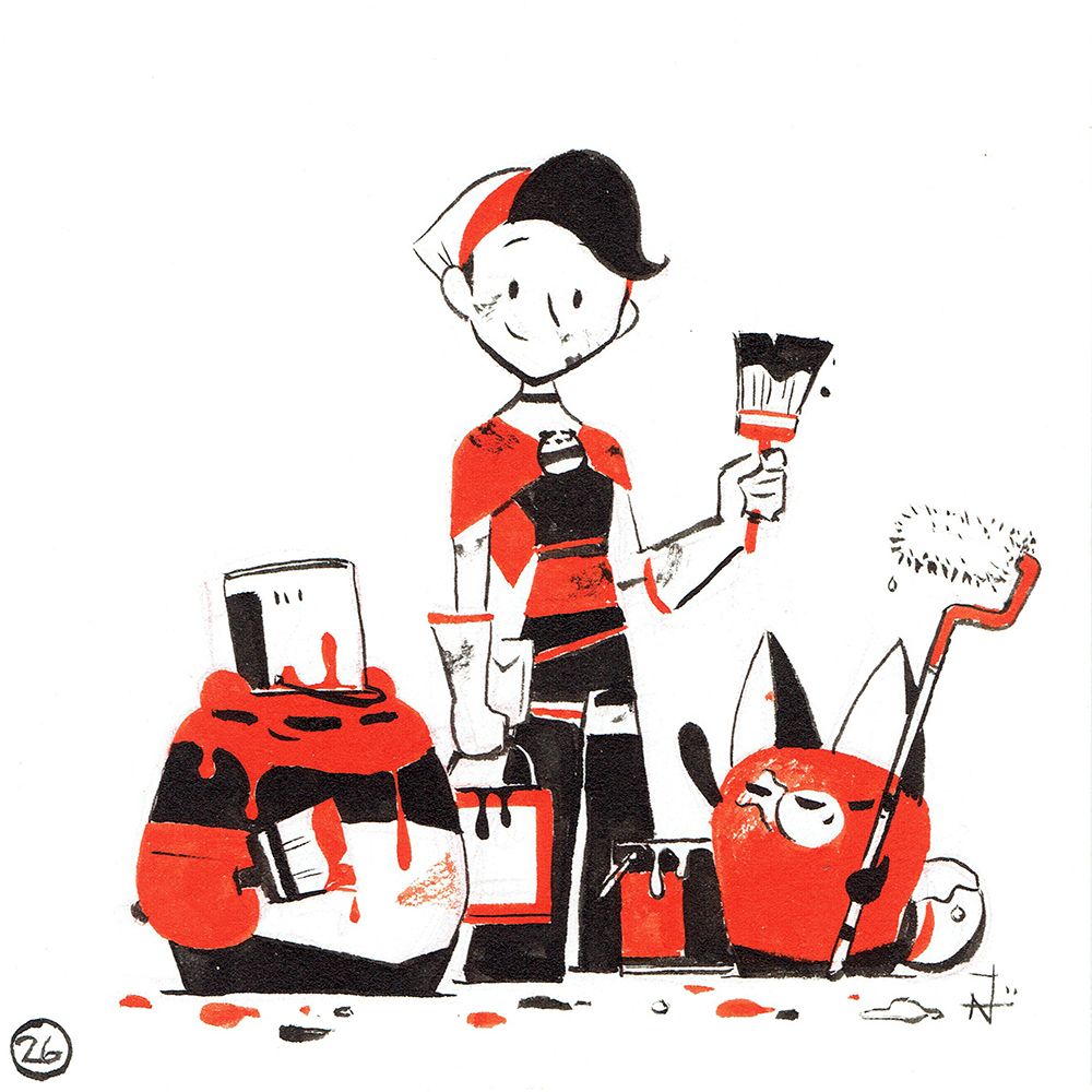
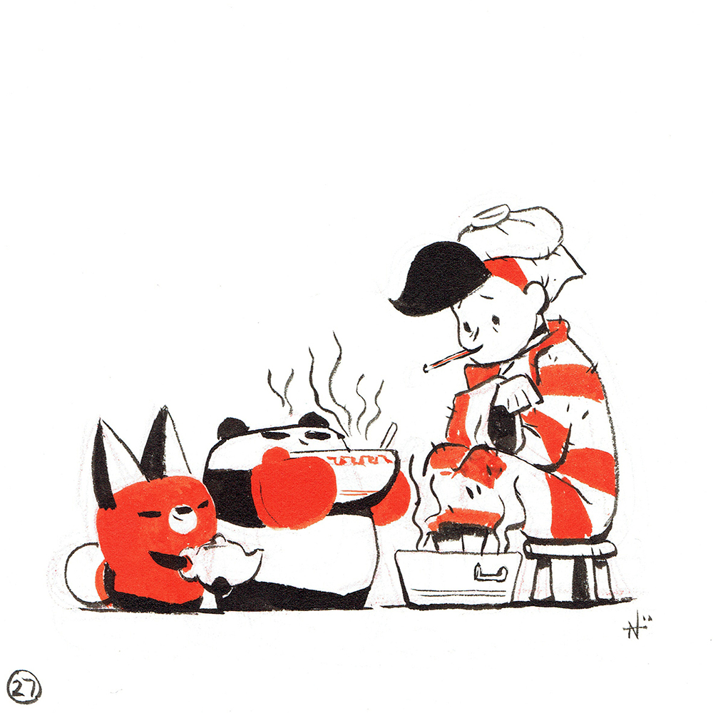
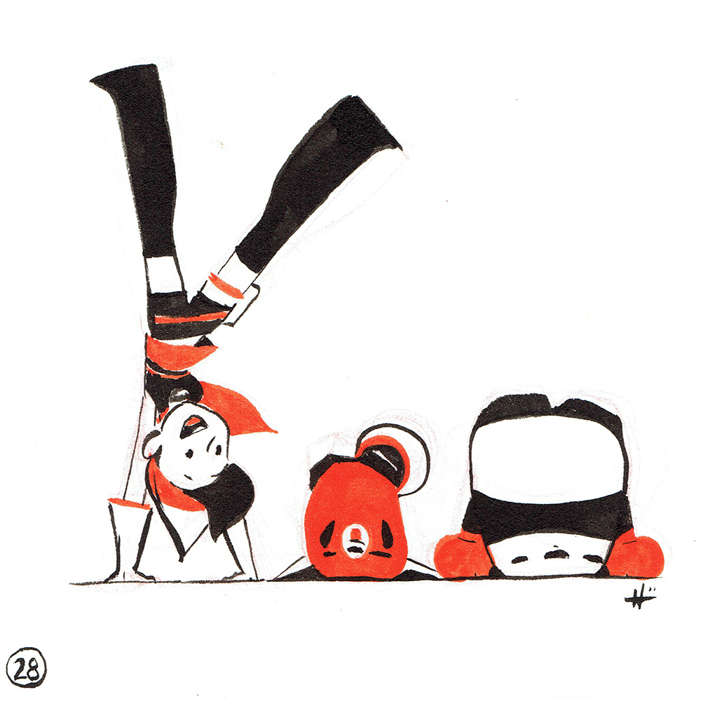
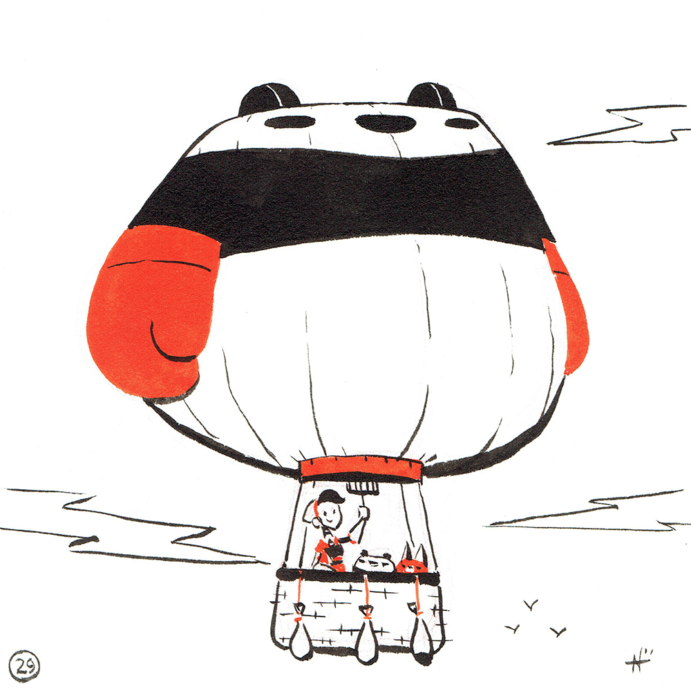
It’s that time of year again! Time to pop bust out the ink and brushes for Inktober. Last year’s drawings took me a long time to finish, I ended up finishing sometime in mid November. This year, I went with smaller sketches so that I could finish them in time especially given how busy life has been lately.

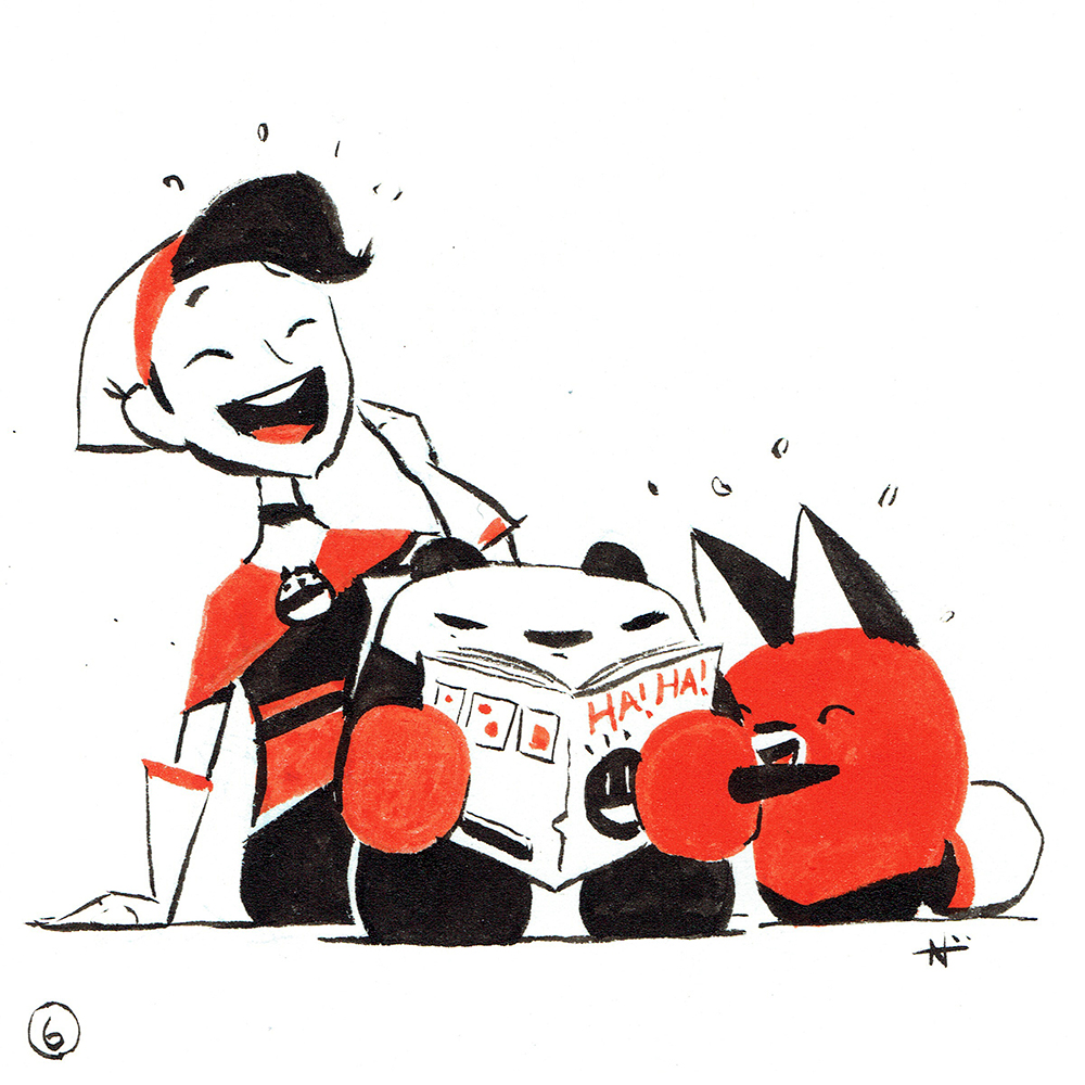
I also wanted to try out a bottle of red sumi ink that I’ve had for a while. It says “red sumi” on the label, but it’s more of a reddish orange. I made the drawings as little vignettes of the Panda Pals, and looking for any potential stories I can tell with them.

I’ve also added all of the originals on my store. Enjoy!

Smartsheet: Endeavour

  • by

This is an overdue post, it’s been pretty hectic trying to sneak in some blogging in between parenting, moving, and remodeling.

Smartsheet commissioned me last summer for a piece based on the title of one of their monthly software releases. For this commission, I had to base the artwork on the title, “Endeavour.” I reviewed some of art of their previous releases, and saw that they were recently going through a space theme, so I decided to have my piece follow in the same vein.

I did some Wikipedia research about the shuttle, Endeavour, and a couple of interesting bits that helped inform the piece. What stood out to me was that it was the first shuttle constructed after the Challenger disaster in 1986, so I wanted to capture a sense of hope after such a tragedy. Also, the definition of the word, “endeavour” is “an attempt,” so that’s why I positioned the cockpit at the moment it crosses the horizon of the earth as it attempts its venture into space.

You can see some of Smartsheet’s previous release artwork which was done by the talented Carissa Weber.

Dreamlander Interview

  • by

Earlier this year, I was interviewed by Paul Hong, aka Dreamlander, who does these great video interview essays on people and passion. He was able to record some of footage while I was tabling at ECCC as well as provide some sneak peeks into my messy workspace at home. I’d say he did a smashing job, although, the guy in the video could put on a few pounds. Check out the video below:

If you’re wondering why I had a bandage on my left thumb during the interview, I had a little bit of a cutting accident with a paper cutter. Don’t worry, it’s all healed; let’s just say it’s not as big as my right.

During the interview, I also made a sketch which I made into a  timelapse video of the panda pals below. If you want to see more of my timelapse videos, you can subscribe to my YouTube channel.

You can watch more of Paul’s other videos on his YouTube channel, also give him a follow on Instragram.

Lastly, I just received my table assignment for Geek Girl Con! You can find me at Table A103, I’ll make a separate post with a map. It’ll be my first convention after my break, so it’s time to roll up my sleeves and get back to work. Have a great start to your week, everyone!
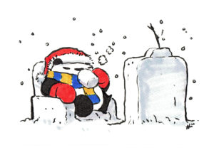
UPDATE: I just added the piece to my store as an art print. You can check out the link here.

Pedal Head

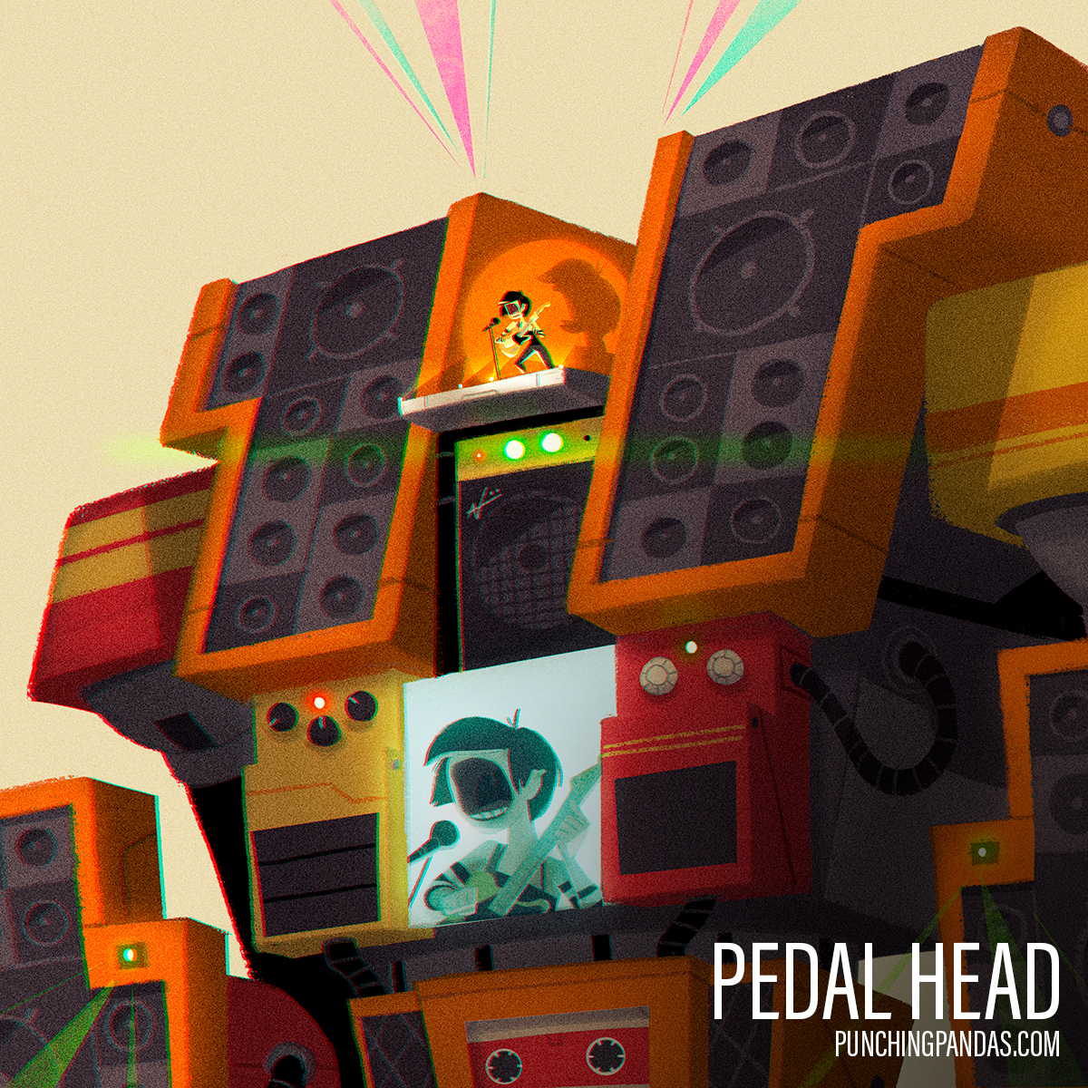
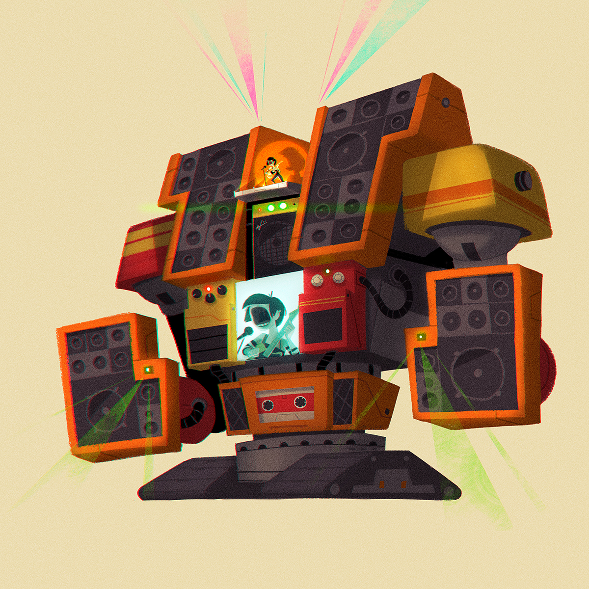
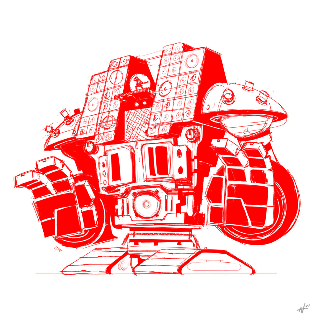
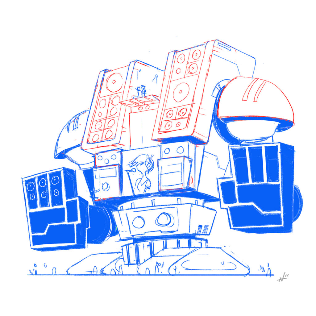
A while ago, I was introduced to the Character Design Challenge when I restarted my Facebook account. It’s similar to the Sketch Dailies themes that I used to participate in except that it’s a monthly theme and there’s more of a format to the submissions. I tried to submit for some of the previous months’ themes, but I would always end up missing the deadline. There’s even a couple of pieces that were pretty far along, but for some reason, I couldn’t figure out how to finish them. After four months of missing the deadlines, I finally got a jump on this month’s theme of “Robots & Androids.” Below is my final submission titled, “Pedal Head,” the massive rock ‘n’ roll droid.

Like I said in my superhero remix post, I’ve been trying to shake off the cobwebs after taking a break from art. I’ve been getting back into the habit of drawing regularly, but having to do robots ended up being a little tougher than I anticipated. It’s not that robots are hard to draw, it’s drawing robots that are interesting that’s the challenge.

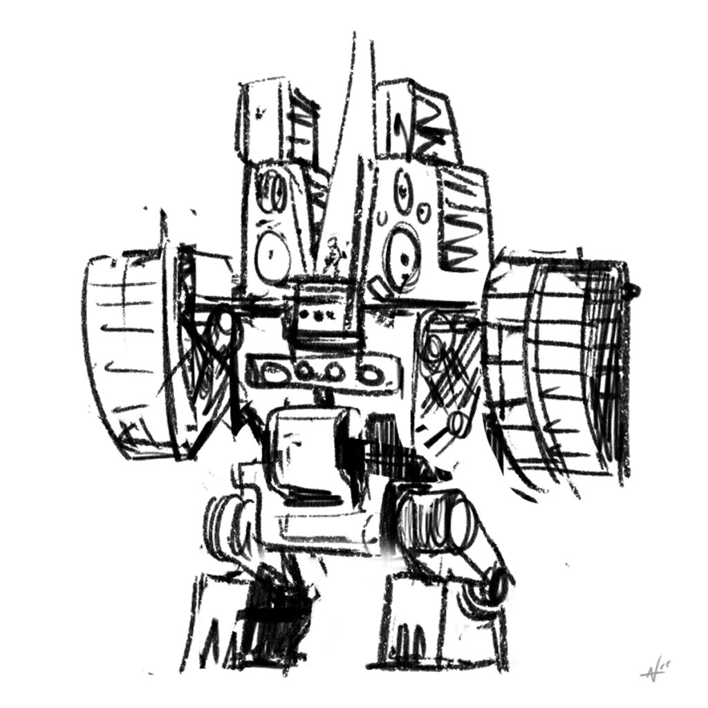
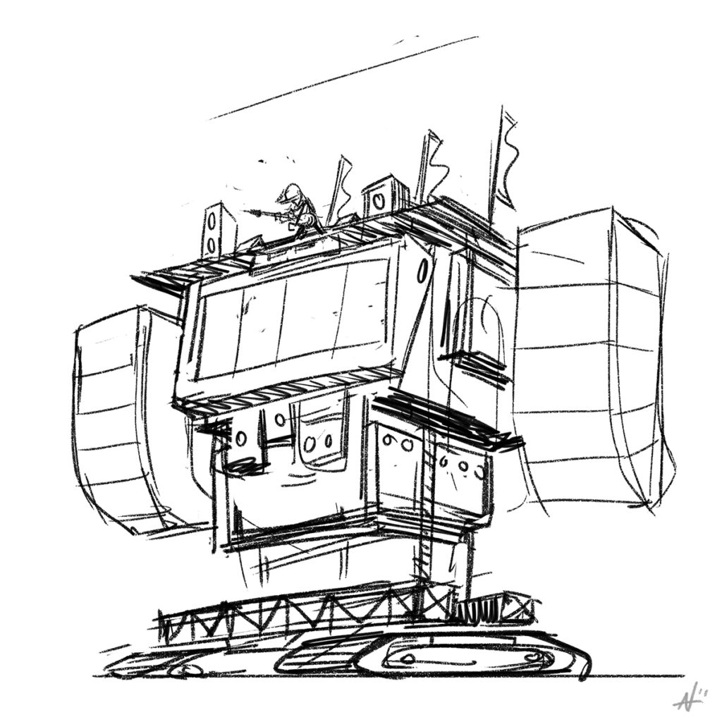
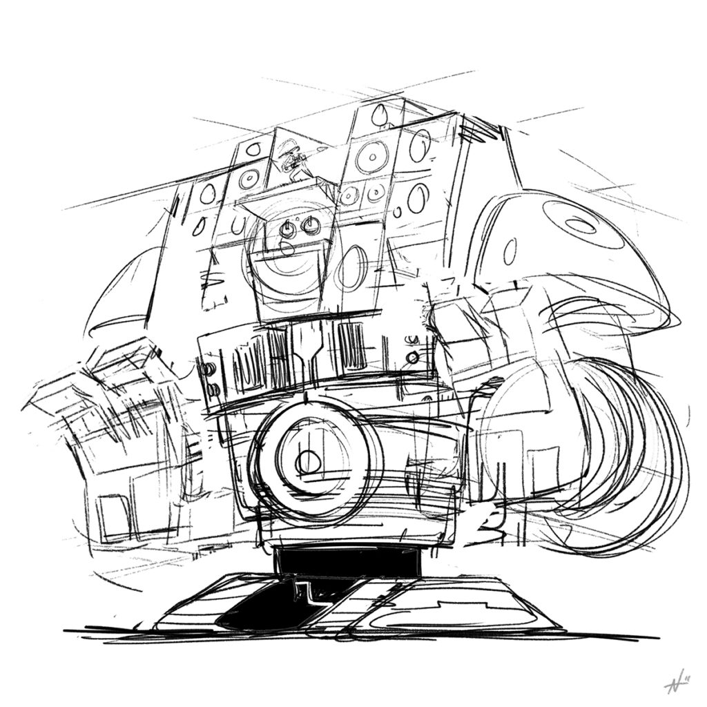
Actually, it was fairly unenjoyable, until the last 10% when it all came together. But it’s satisfying to be able to figure out the design in the end. Below are some of the iterations that I had to go through to arrive at the final piece. By the fifth sketch, I was nearly ready to chuck my Wacom pen at the wall like a dart. Eventually I had to call it quits, better finished than perfect, I suppose.

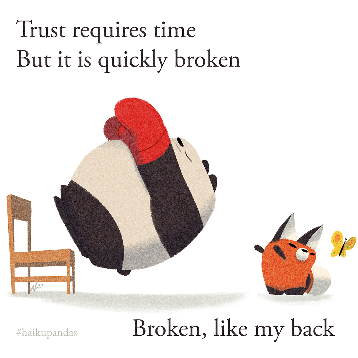
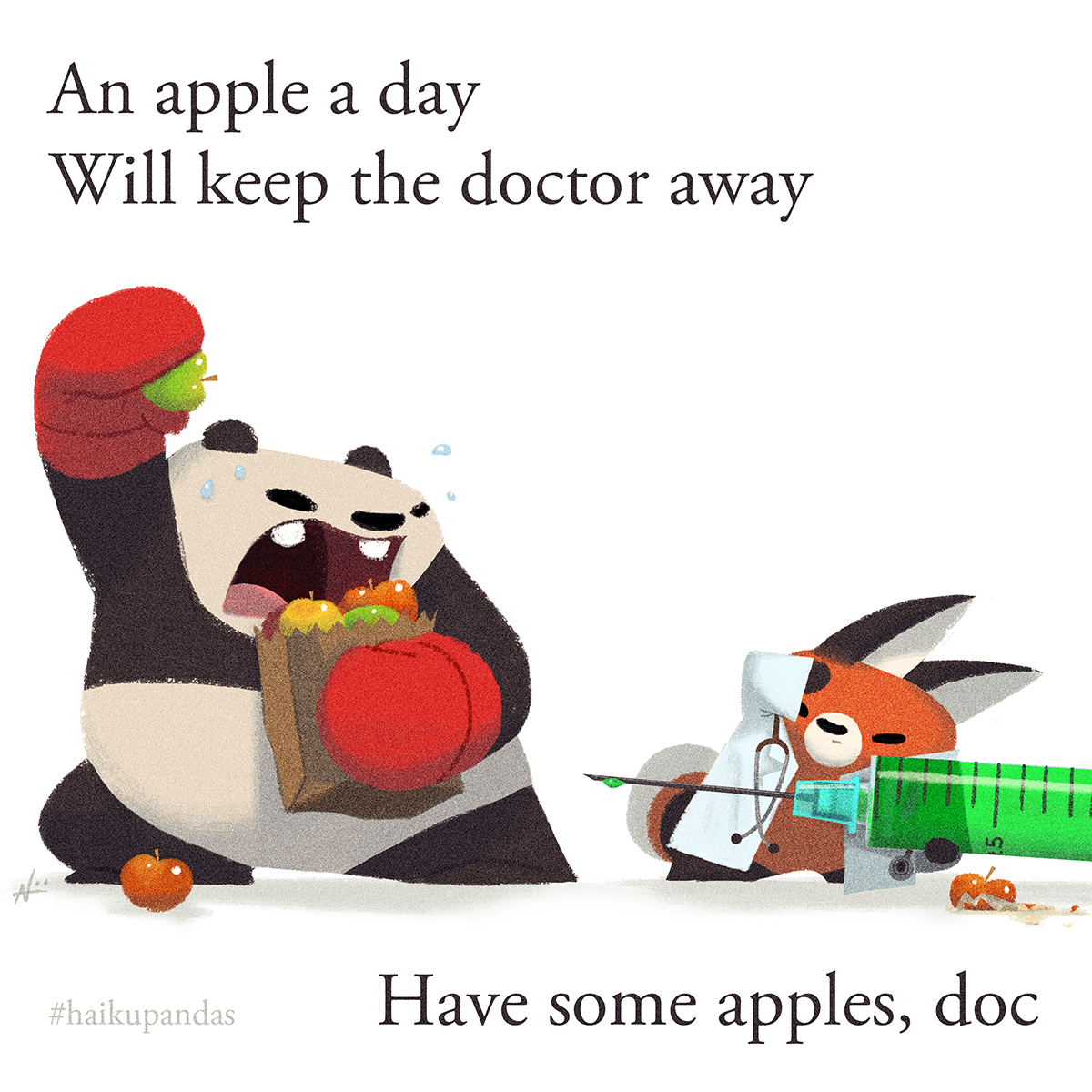
As a reminder, Geek Girl Con is coming up soon September 30 – October 1. I still haven’t received my table assignment yet, but I will mention in a future post once I get it. I’m looking to see if I can get the “Haiku Pandas” together as a book, but I have a few more drawings that I need to finish in order for it to feel complete enough.

Also, I added my “Stand By Me” piece for the Stephen King tribute show to my shop. If there’s a piece on this blog that you’d like to see as a print, please leave a suggestion in the comments below.

Have a great rest of the week!

PS: There’s a panda in there. ;)

Throwback Thursday

  • by

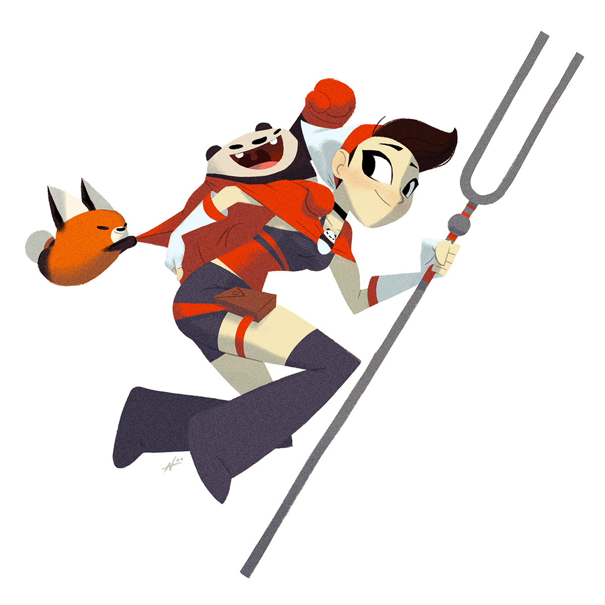
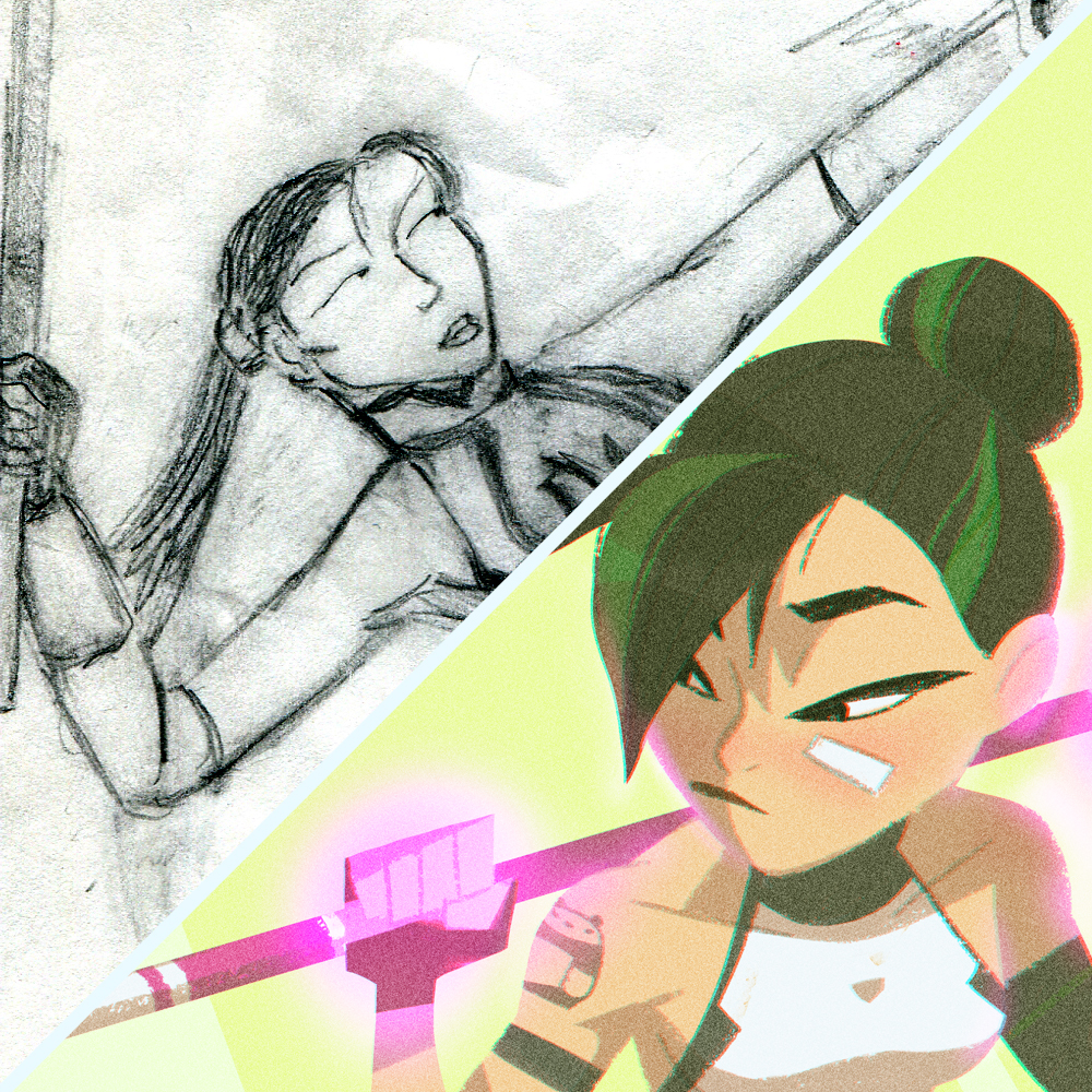
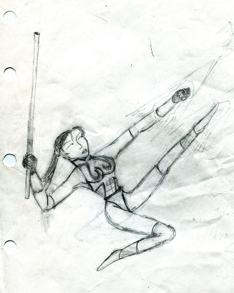
I was rummaging through my childhood drawings and came across some of my early superhero drawings. I was a big fan of the X-Men TV-series back in the 90’s, and it has always been my favorite Marvel property. Of course I still enjoyed Batman, Superman, and Spider-Man, but X-Men always seemed more interesting to me with the way they tied in unconventional super powers, political drama, and interesting personalities (“Hey, bub!”).

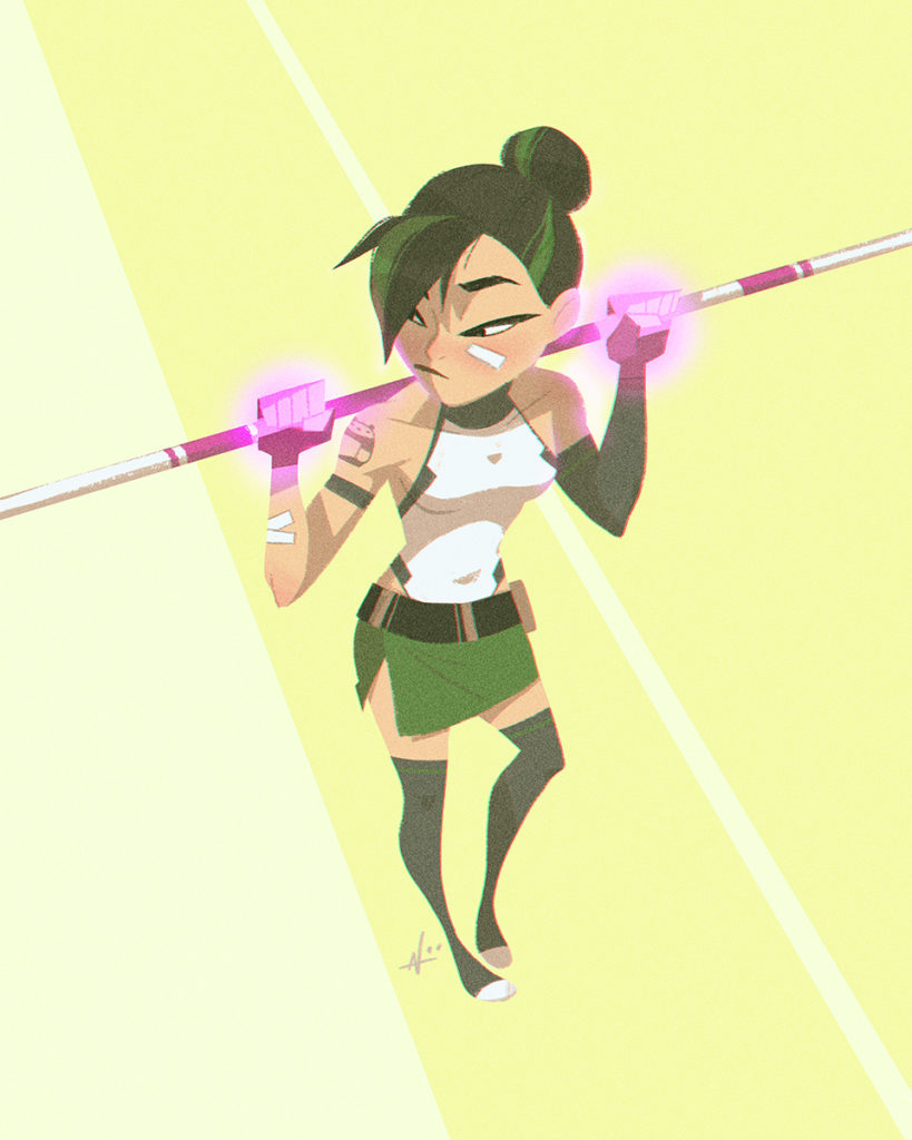
Middle school became my superhero/videogame phase. Although I didn’t have much money to purchase comics or a console, I’d make up for it by drawing my own versions of X-Men and Megaman villains. They weren’t that great, mind you, but it eventually led me towards drawing humans. Anyways, I thought it would be a fun exercise to redraw one of my old characters. I don’t have a name for her, but she was supposed to be a Chun-Li/Psylocke type. I’ve also been going through a drawing funk and have been having trouble finishing some of my personal sketches. Maybe years from now, I’ll cringe at this new drawing and do another remix.

She punches and kicks at the same time!
Superhero remix!
Refocus

  • by

I have a hard time relaxing. I wear a nightguard when I sleep.  I enjoy painful deep-tissue massages. My brow is naturally furrowed. When I’m at the beach, I’m constantly checking to make sure I have enough sunscreen to cover my pasty body, and when I lie down, I keep an eye open for anyone looking to steal my belongings. And even though I see the need to relax more often, I don’t like taking many breaks away from art. Though recently, life has forced me to take one.

Don’t worry, the reason is a good one; a very good one, actually. A couple of months ago, I became a father, and there is so much to unpack from that statement alone. Even during the pregnancy, I couldn’t anticipate how profound an impact having a child would have on my life.  The moment my son was born, I felt like I had stepped into a new world with new realities. And while the transition to fatherhood has been such a blessing, it comes with its own set of needs, needs that take priority over being an artist.

To help me during this adjustment, I wanted to write a short post as a little self-therapy. When I say “self-therapy”, it’s not that I’m struggling with being a father (I am), there’s just been a lot to think about these past few months. Part of it is the process of sorting through priorities now that the time available to make art has become much more limited. In terms of art, there are certain projects that have been on my backburner for a while, and now there’s a sense of urgency to finish them. But even art takes a backseat compared to the responsibilities of being a father and husband.

Because I didn’t draw that much during the break, I’ve got a lot of rust to shake off. I feel like I’m a better artist than I was a year ago, but I wouldn’t say I feel that confident in my art at the present.  Lately, I’ve been revisiting some basics to help build my confidence back, and while it looks rough, I have hope the practice will pay off. Eventually I’d like to show some of the progress of that journey, but right now, things are a bit messy. (Then again, this post isn’t what you call a literary masterpiece.)

Anyways, it’s an exciting time. I look forward to sharing more with you in the months to come. Thanks for listening.

-N